Living Room Inspiration with Rolling Library Ladder
Blog post contributed by the project’s designer, Rebecca, of Maison Ellie.
Imagery by Sonia V Branding.
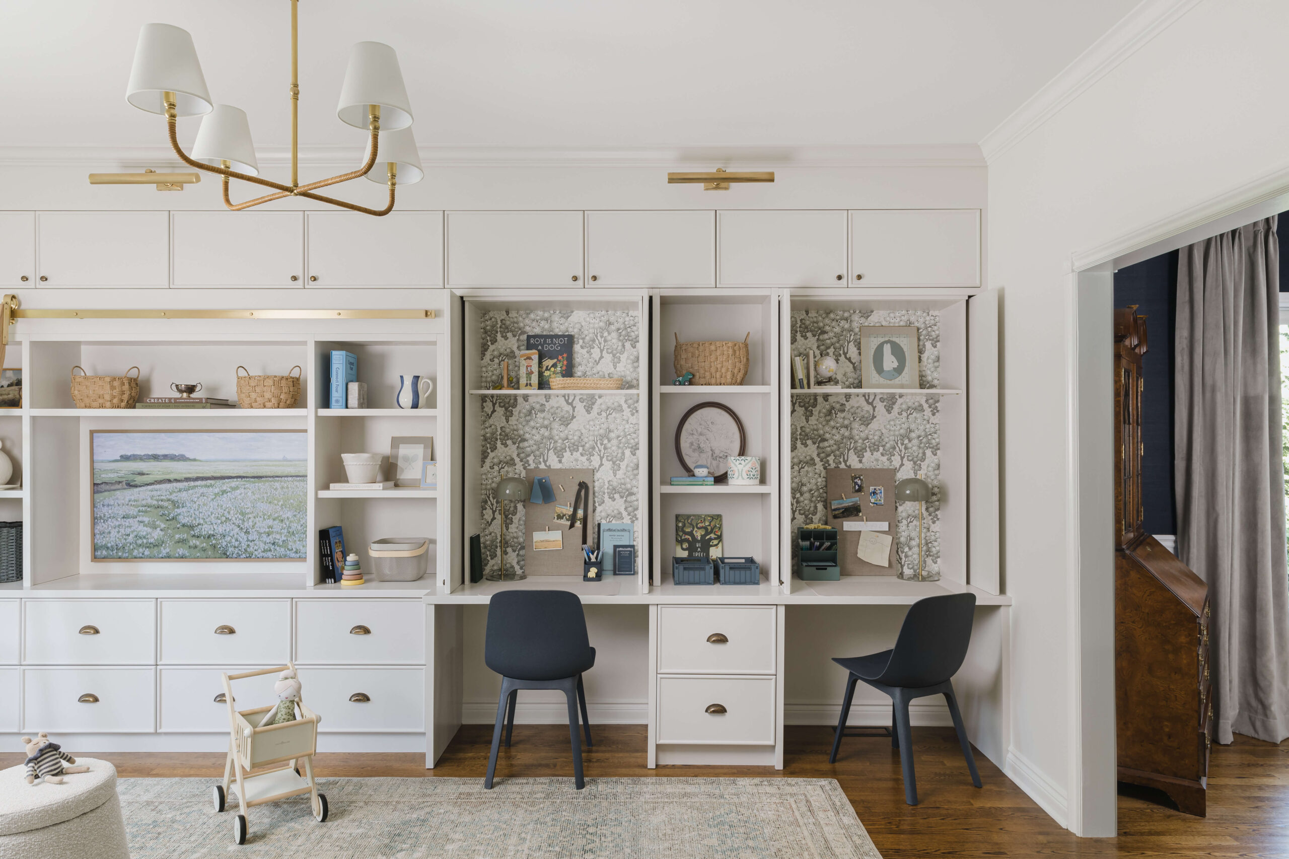
This incredible project blends an inviting aesthetic with a rich colour palette, playful patterns and a timeless atmosphere. Rebecca, from Maison Ellie Interiors, designed over 16 feet of custom millwork to incorporate a rolling library ladder, display shelves, closed toy storage and two desk nooks with pocket doors to hide away the mess when needed! This design was a joy to photograph and every corner I turned had another unique angle that could be captured beautifully to provide you with some major living room inspiration.
Want to learn all about how Rebecca completely transformed an underutilized front sitting room into a beautiful and functional multi-purpose family room? Here’s what she has to say.
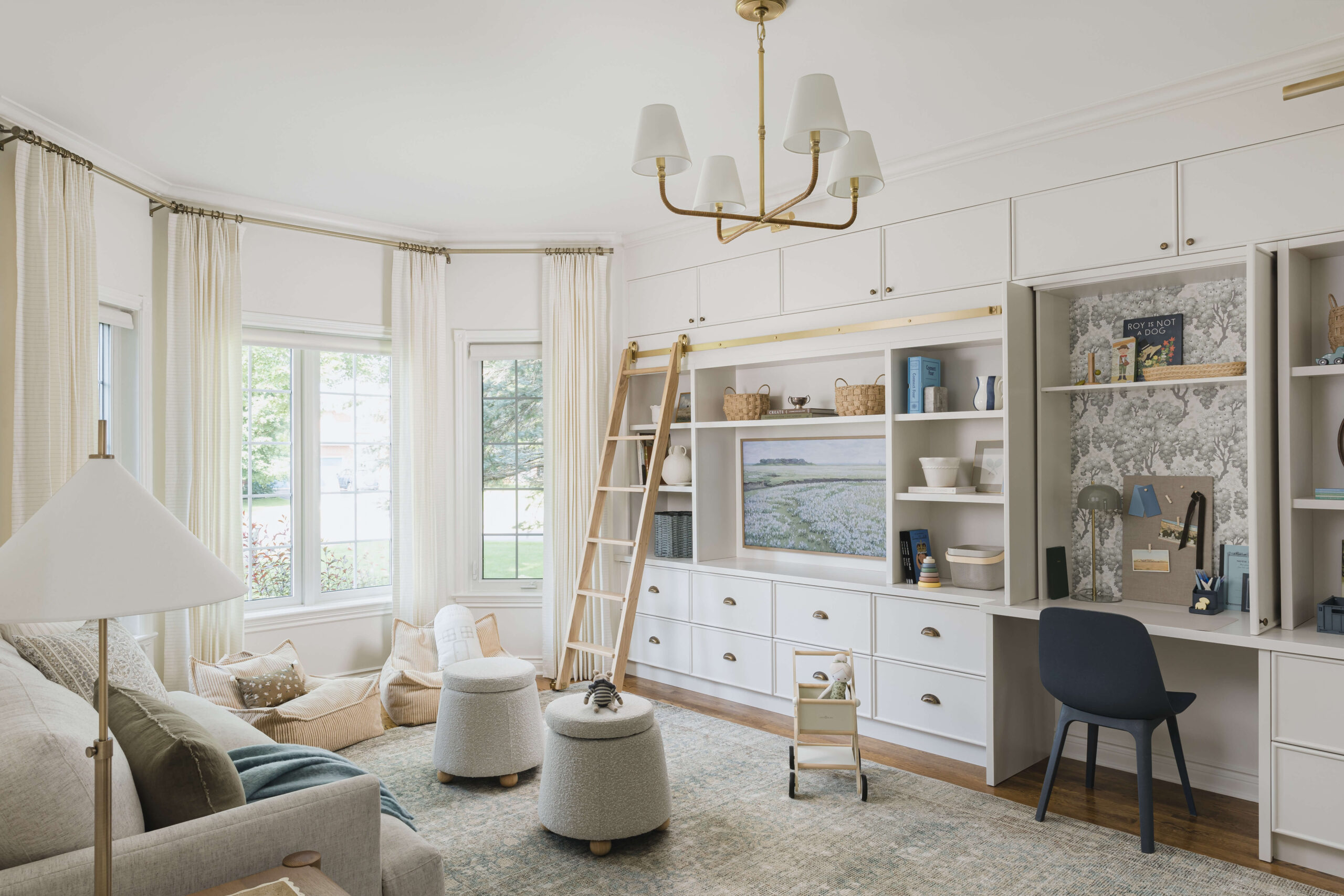
“From play space to future homework room, many functions were taken into account to bring this project to life! I leaned into an earthy and natural aesthetic that still feels fun and colourful. I adore how the pops of french blue and olive green blend in so effortlessly with the antique brass, white oak and darker wood tones. It feels warm and moody yet airy at the same time… which has such a calming effect.
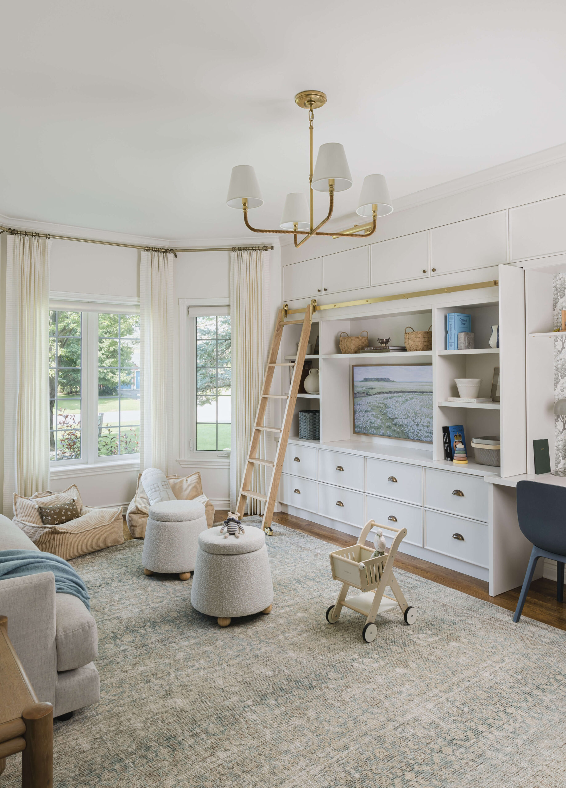
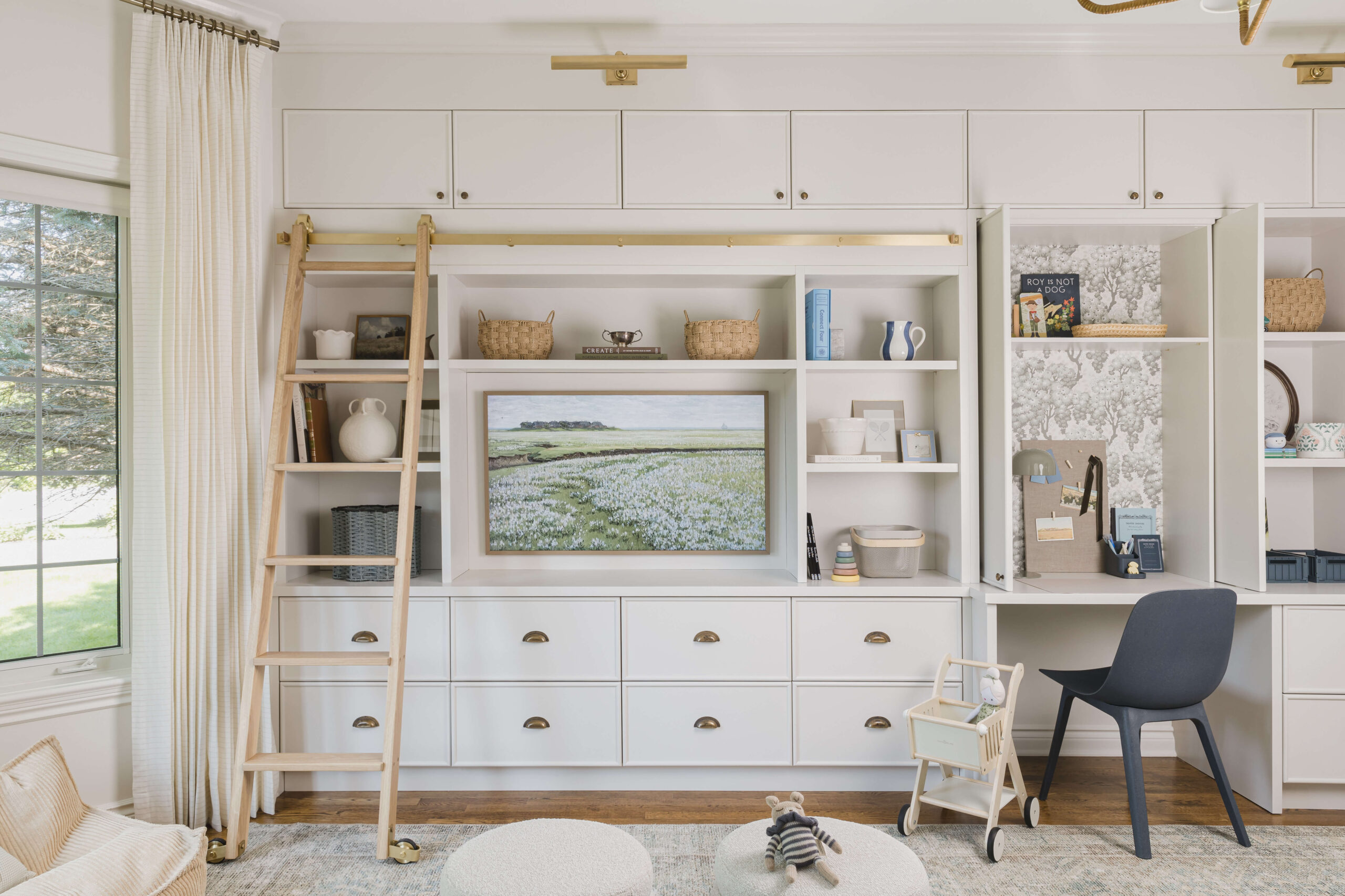
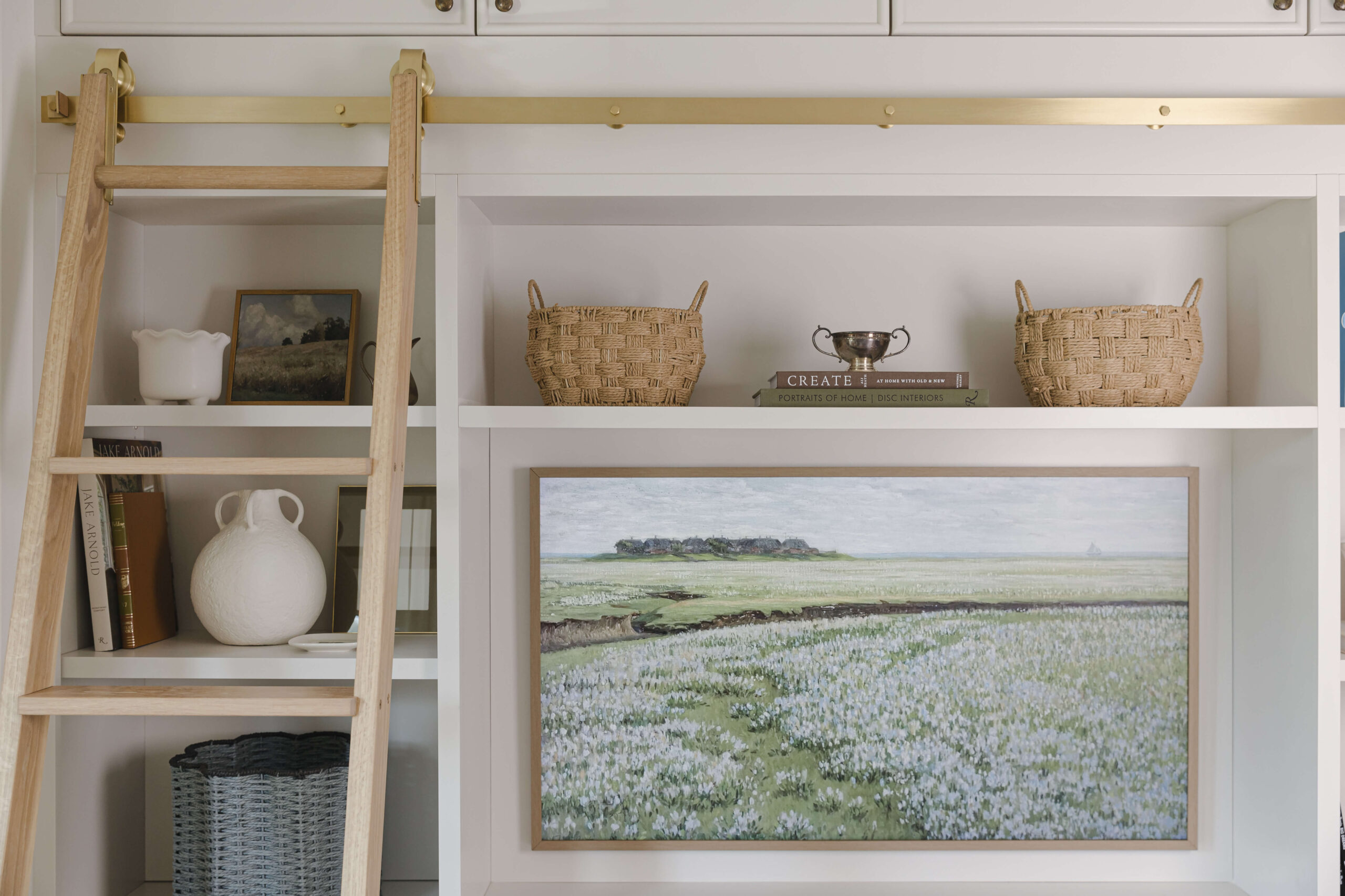
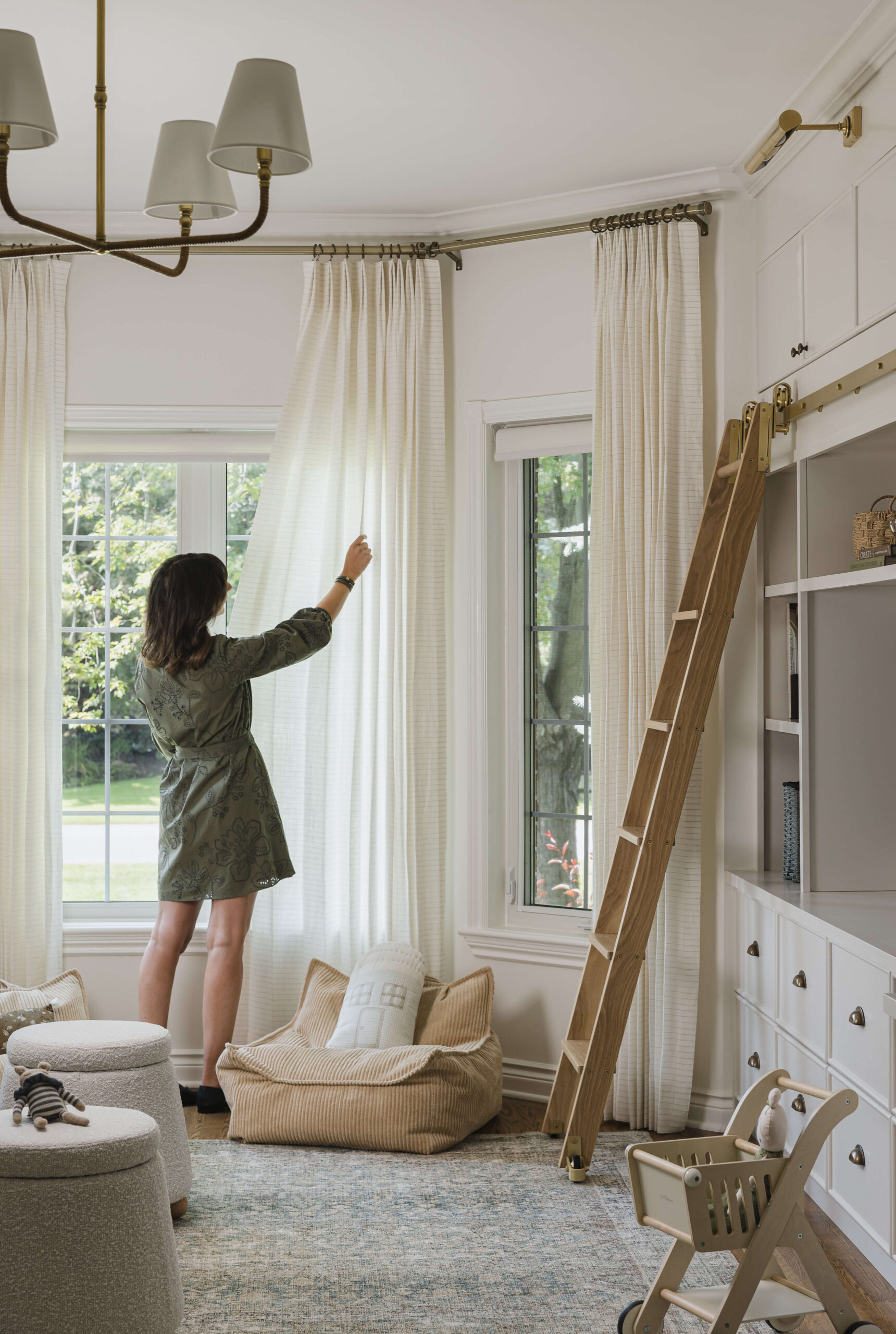
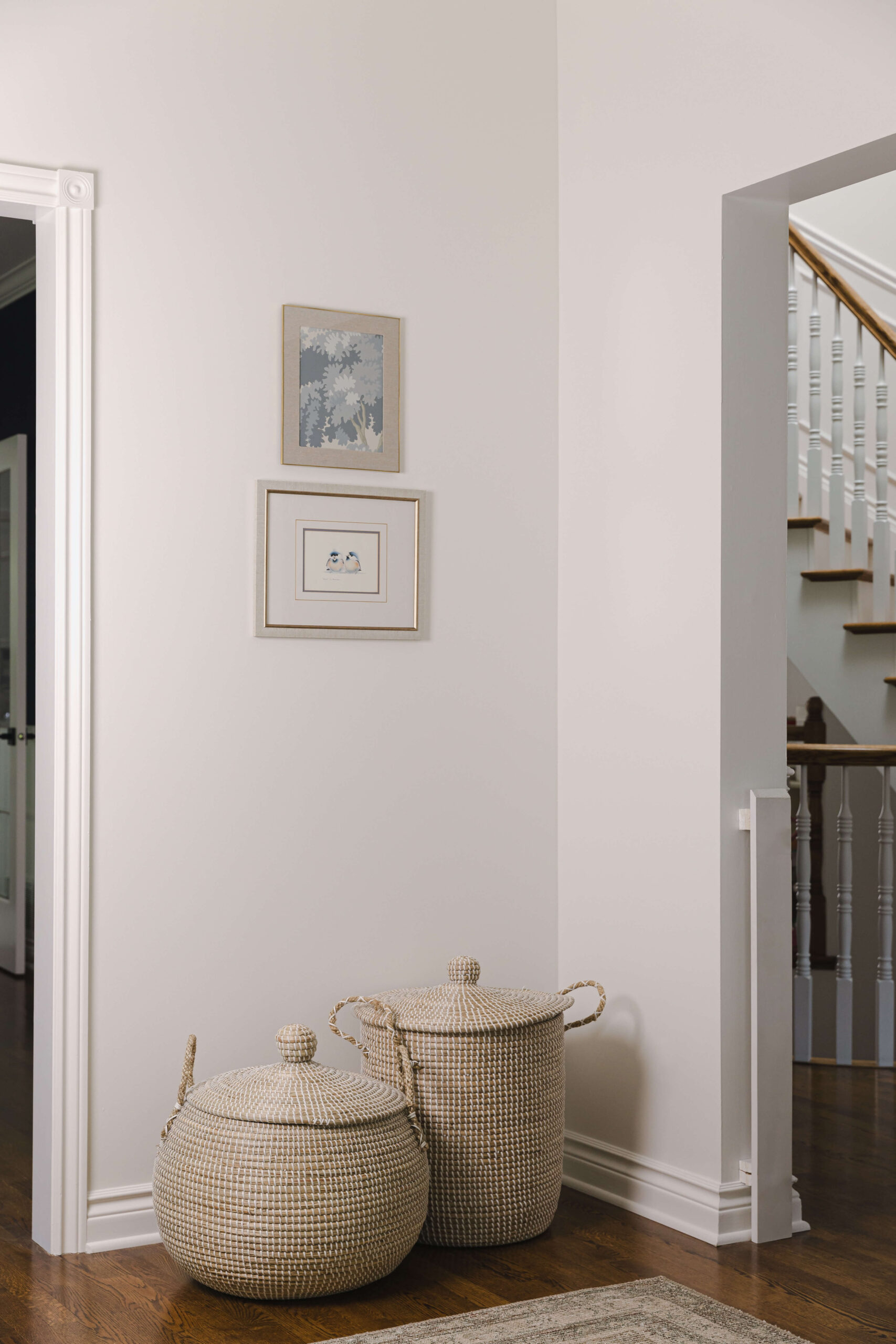
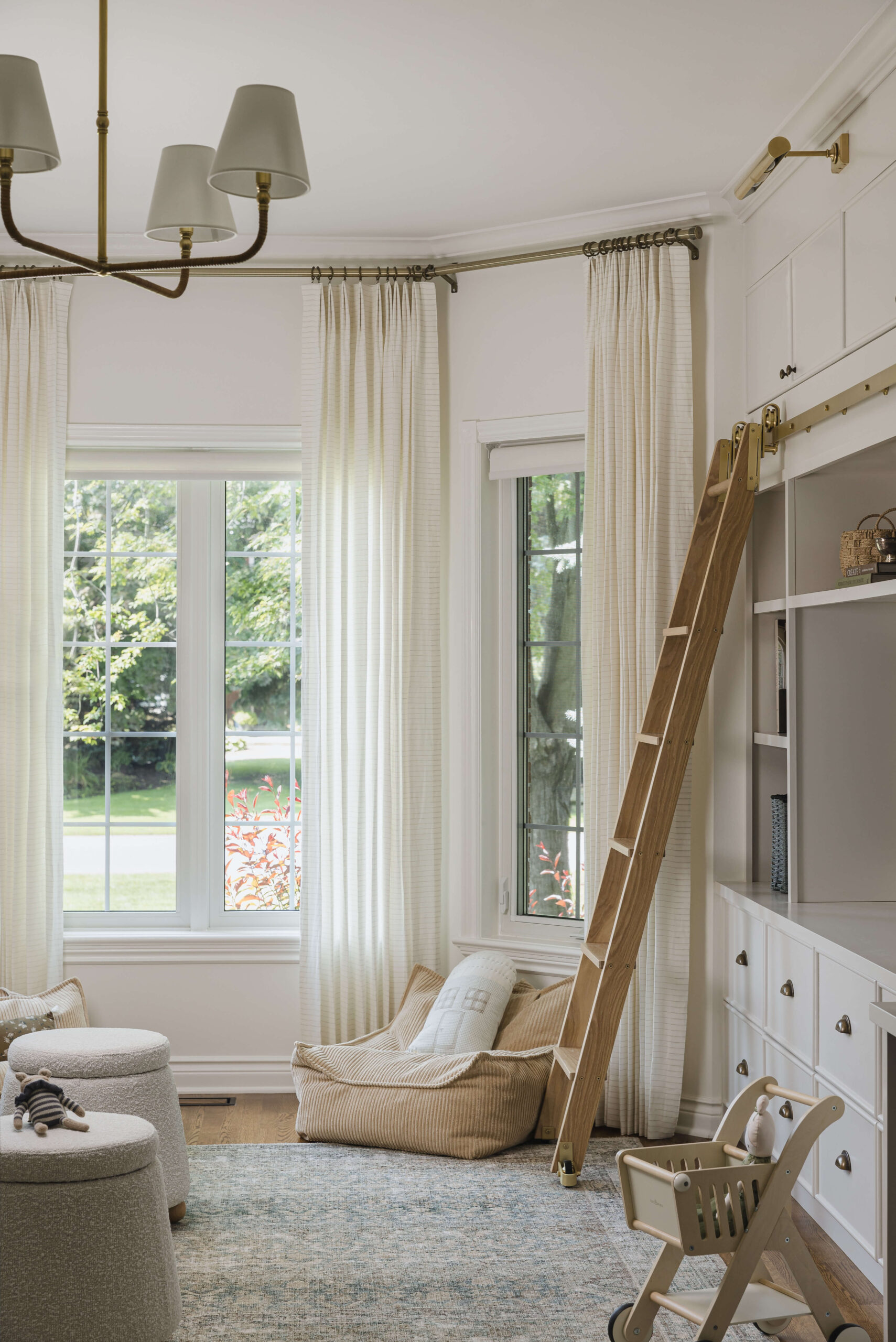
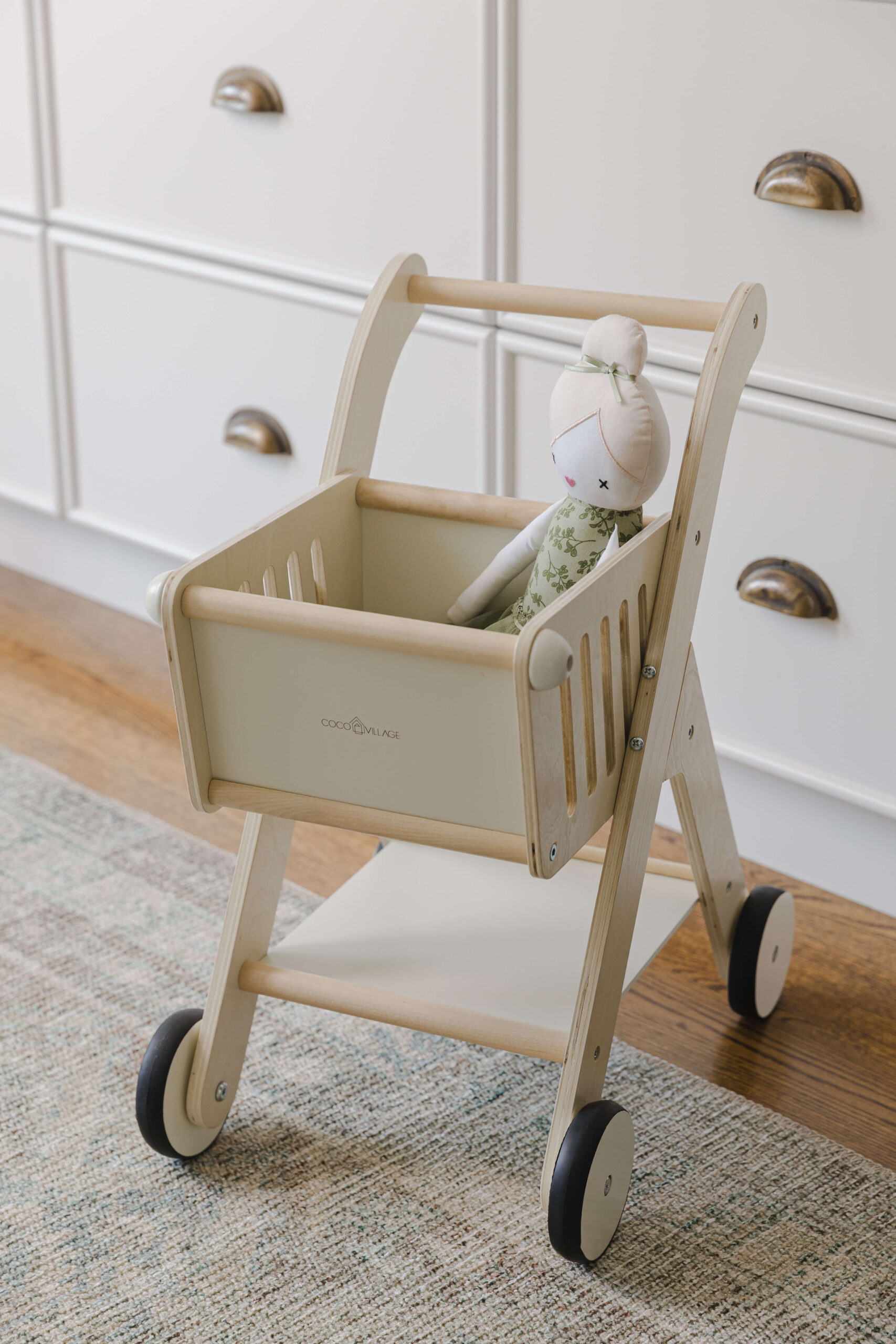
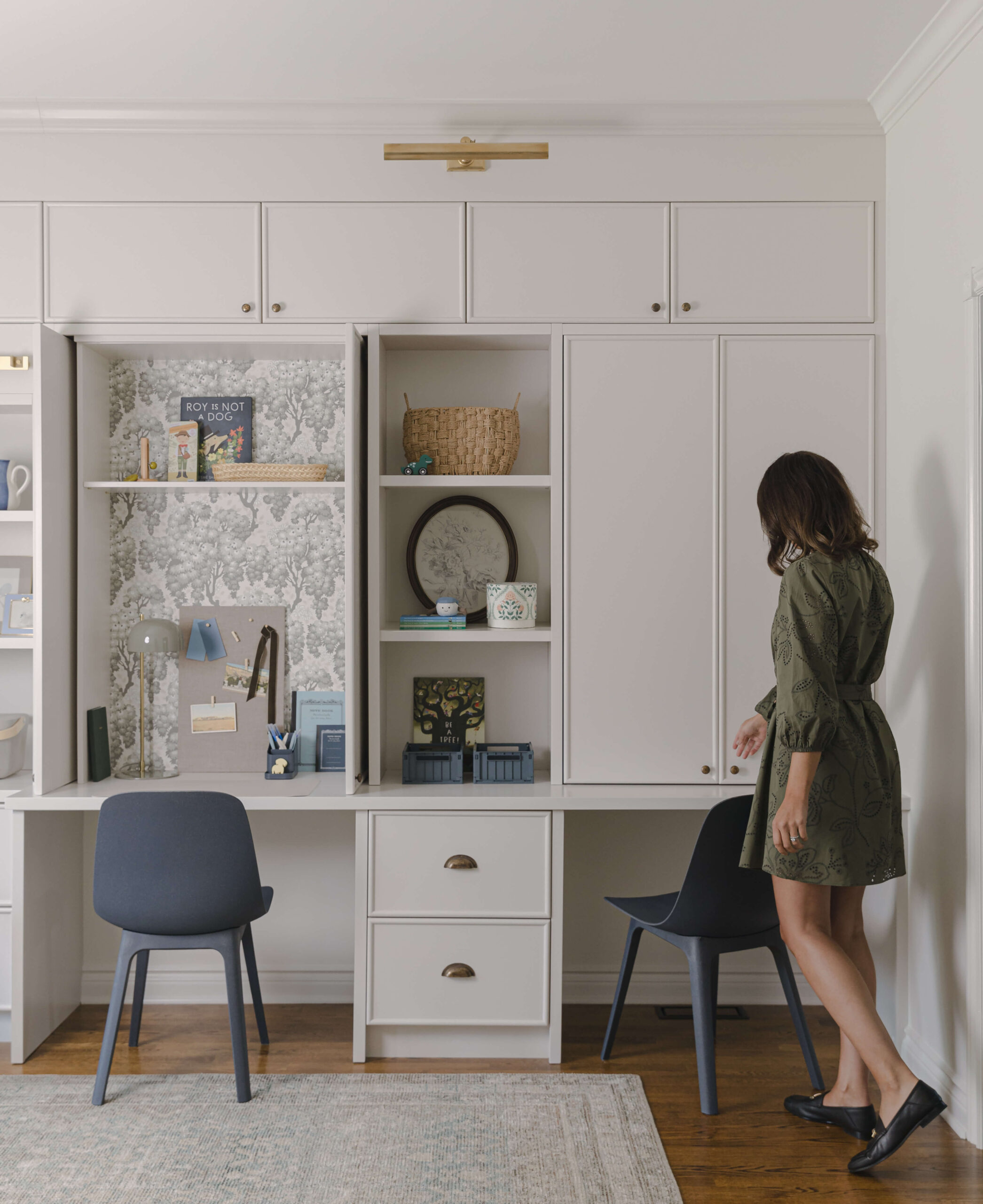
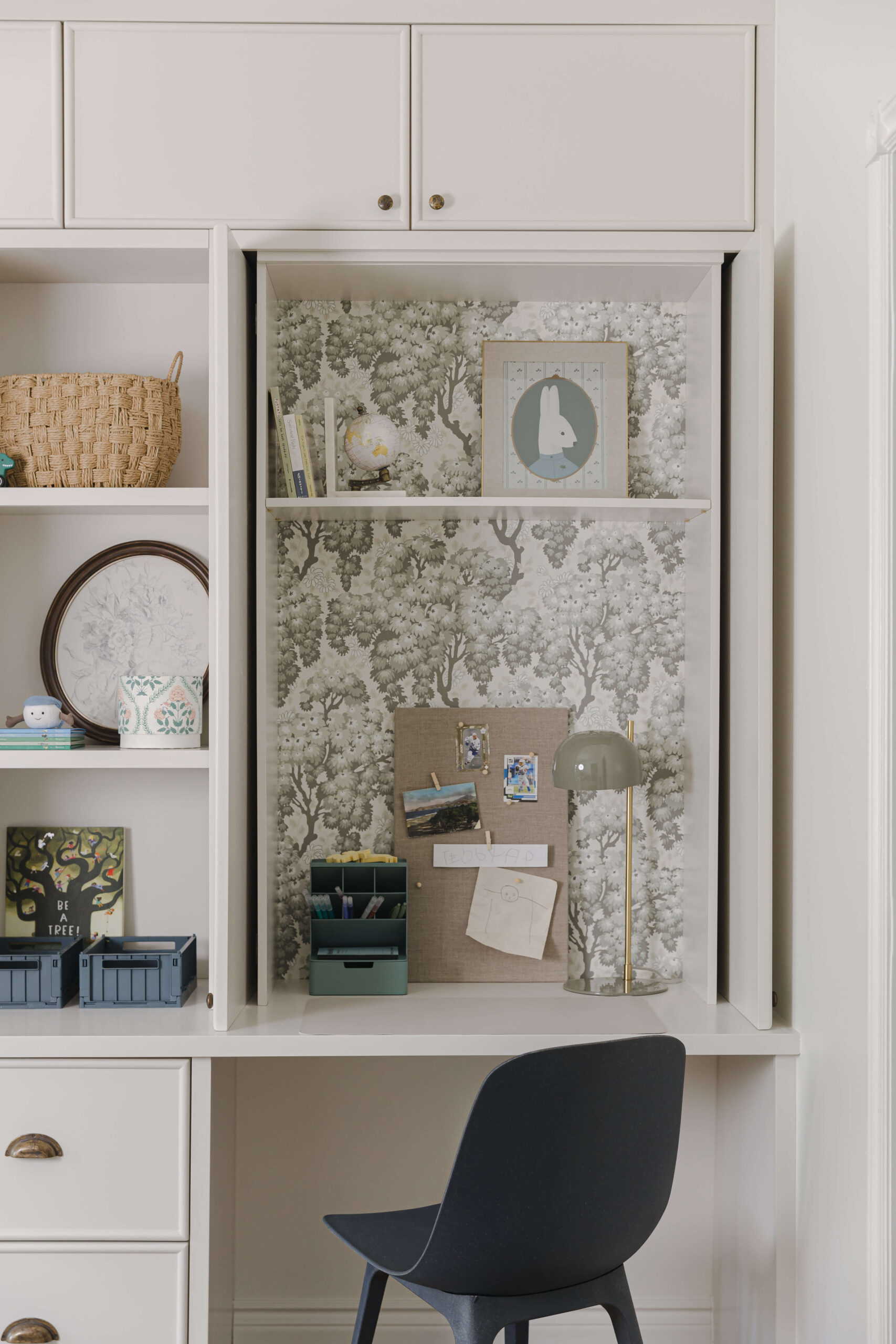
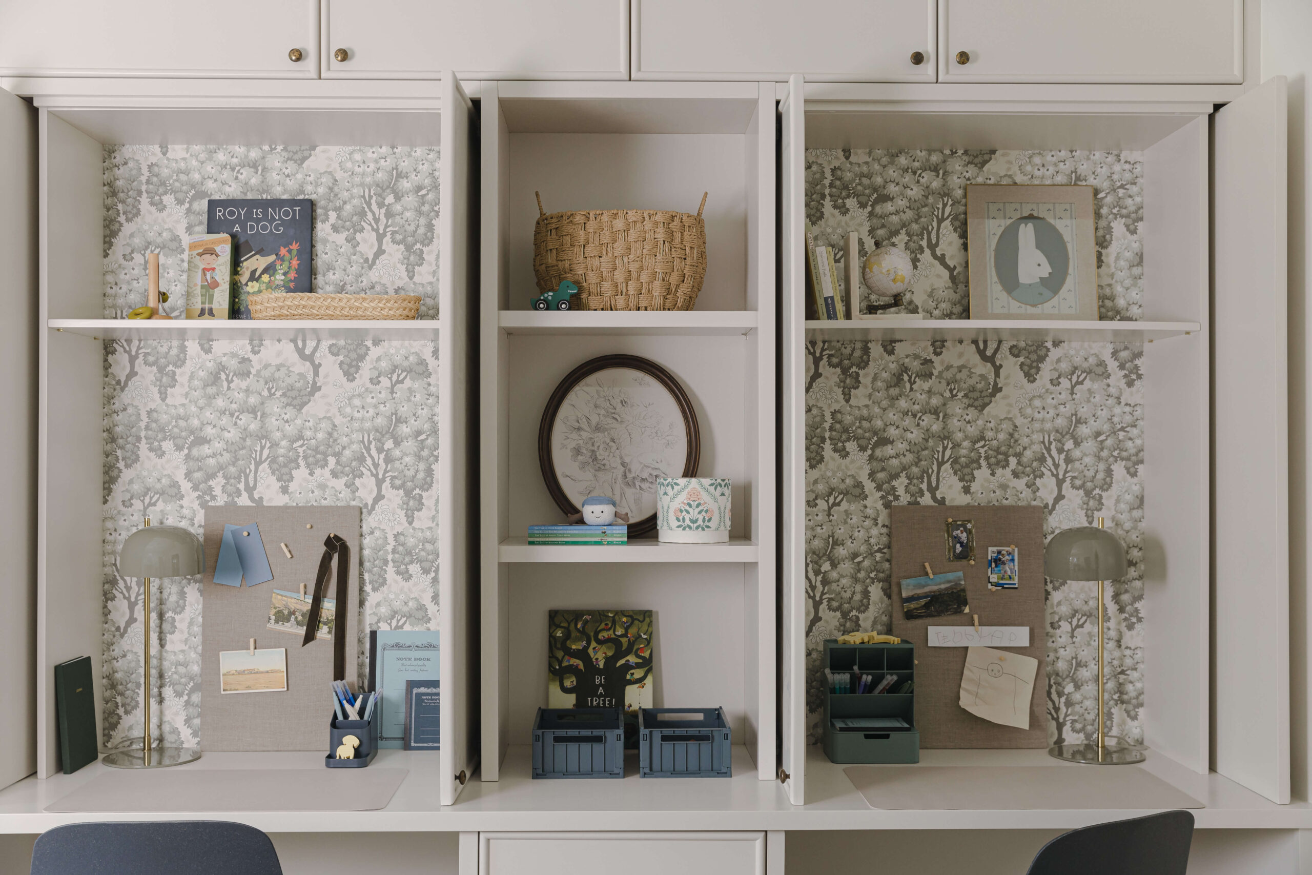
We added over 16 feet of custom millwork split into two sides to serve several purposes; closed toy storage drawers, open display shelving, a rolling library ladder and two separate desk nooks. My clients also wanted the ability to hide away the desk mess when needed, so we incorporated pocket doors that seamlessly blend in with the rest of the millwork when closed. The thin beaded detailing on the door fronts paired with antique brass hardware adds a touch of sophistication to the room. We also added picture lights that tie in beautifully with the burnished antique brass and rattan chandelier!

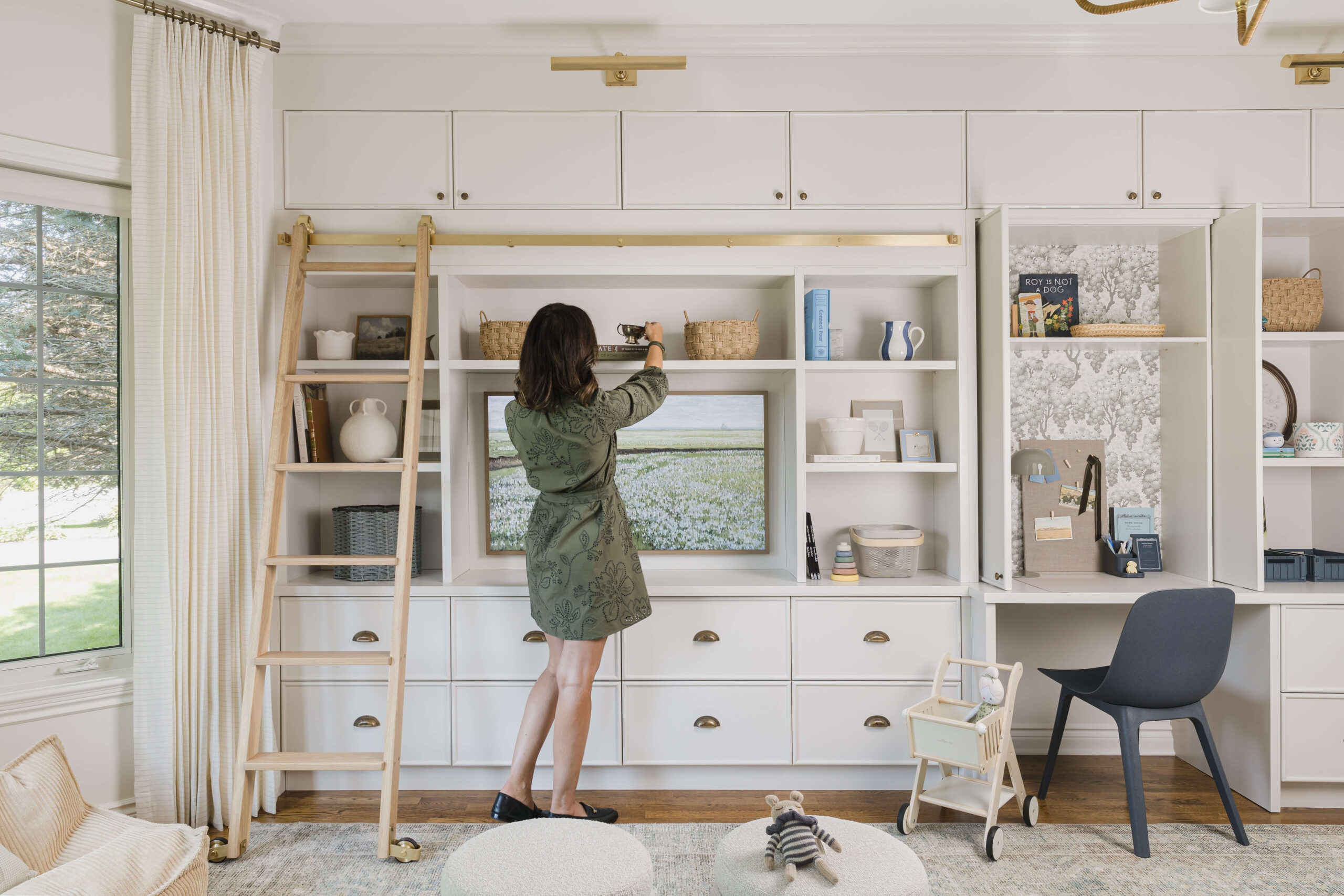
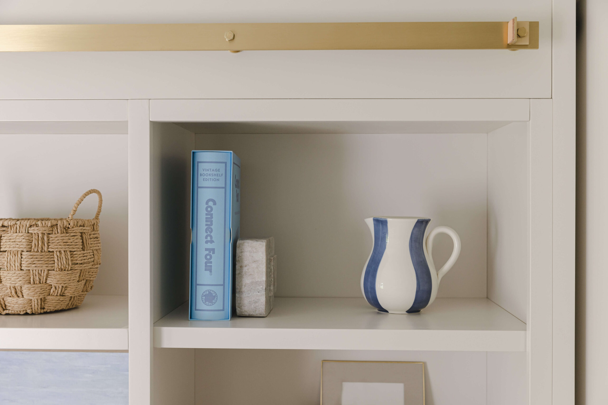
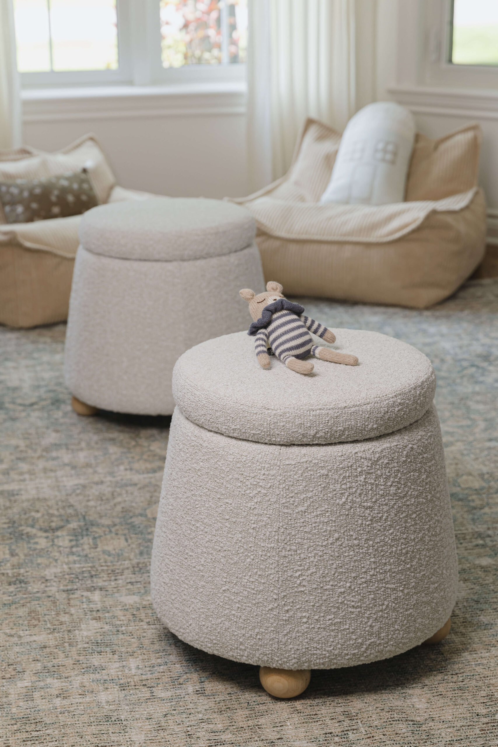
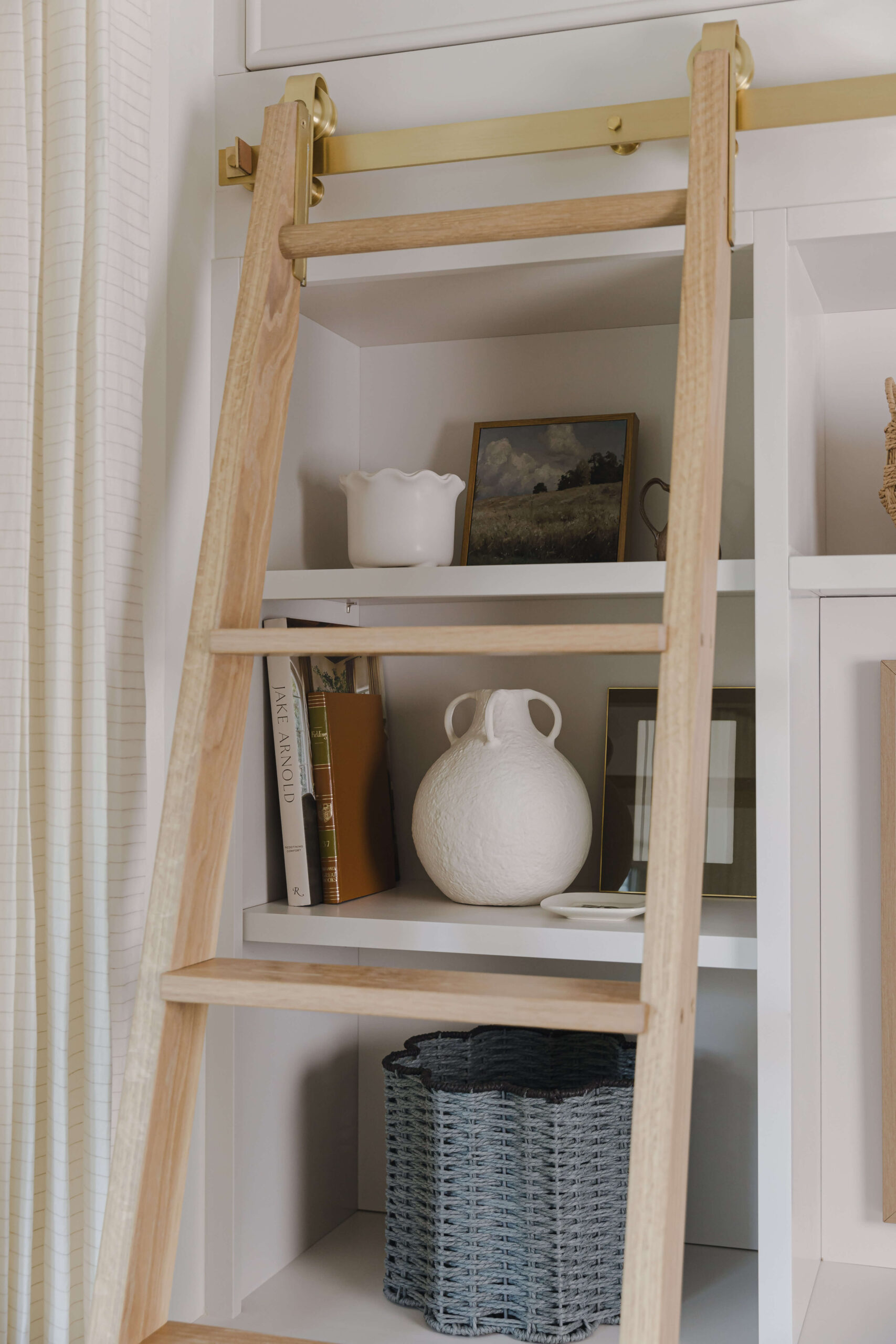
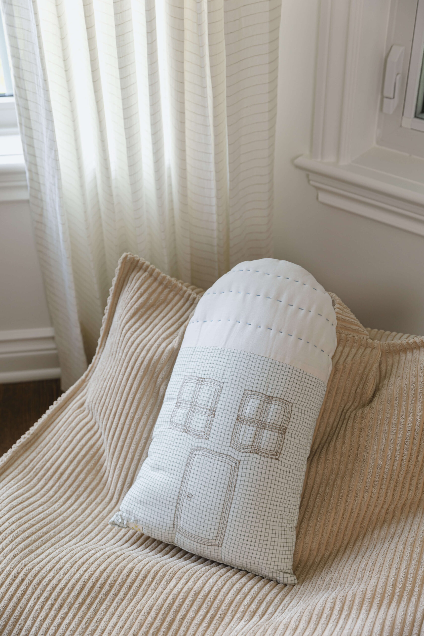
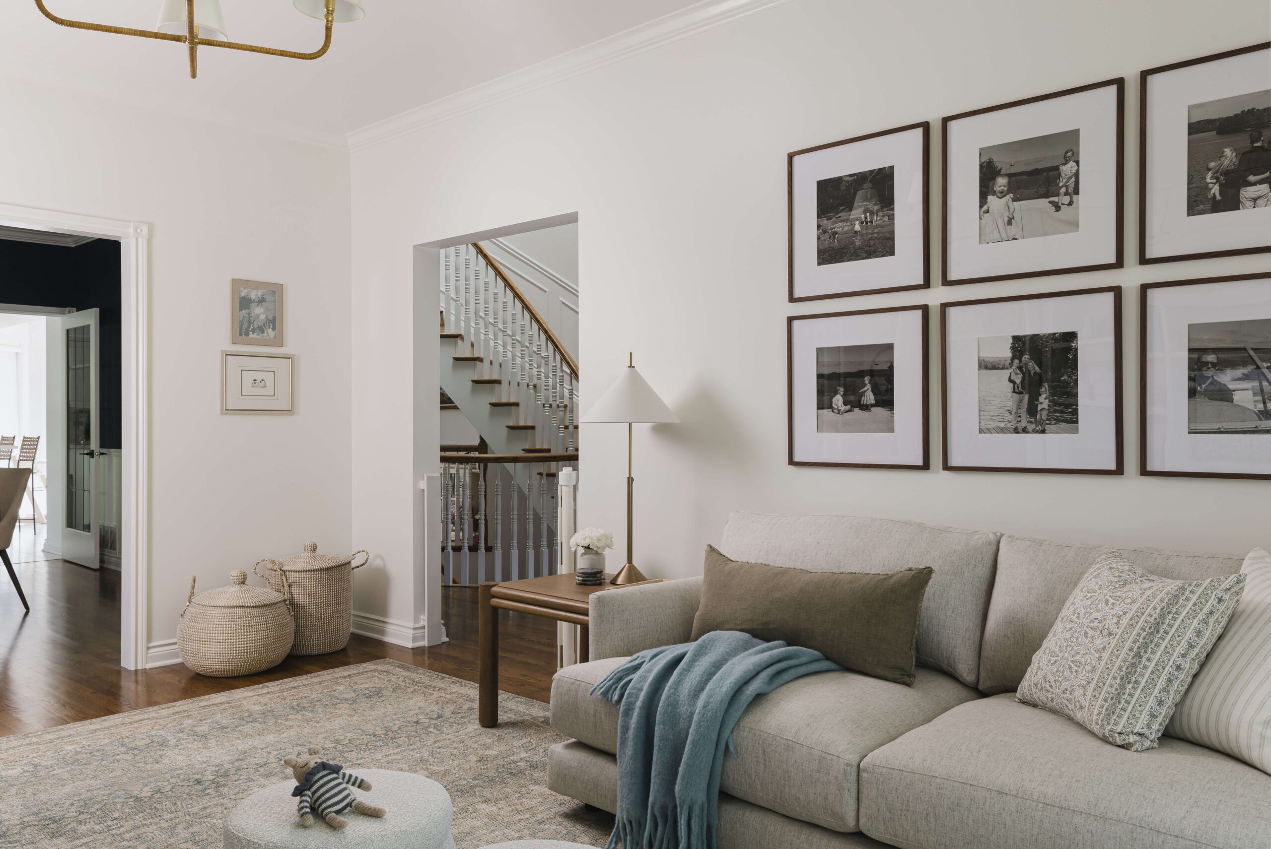
I sourced a super plush sofa that sits perfectly centered on the TV (these are the types of details that I obsess over), and it works so well with the square side table and family photo gallery wall above. With a young toddler that’s on the move, we opted for small storage ottomans in lieu of a large coffee table — the ottomans can be moved around more easily when extra floor space is needed for play. The bay window was literally calling for bean bags, which the kids can enjoy for movie night or reading. We also had beautiful drapes made for the bay window in a delicate linen-blend stripe fabric, which softens things up and adds a subtle pattern to the room. Lastly, an oversized vintage-inspired rug helps to ground all of the elements and provides lots of space to spread out with trucks, puzzles and toys.
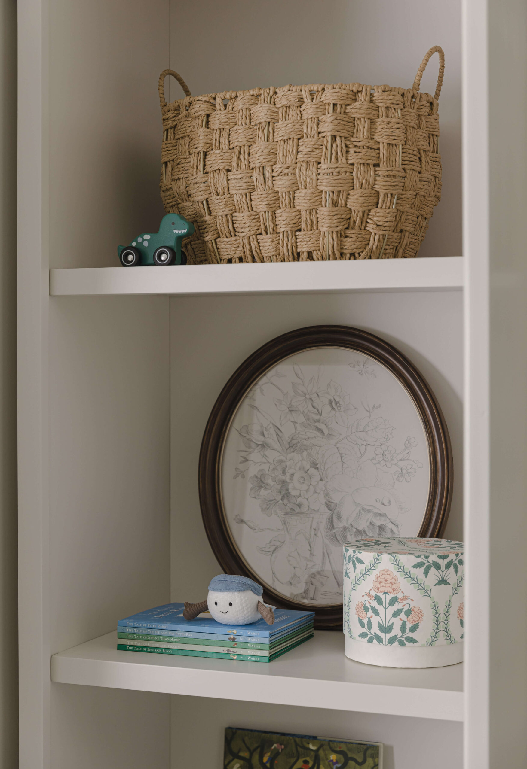
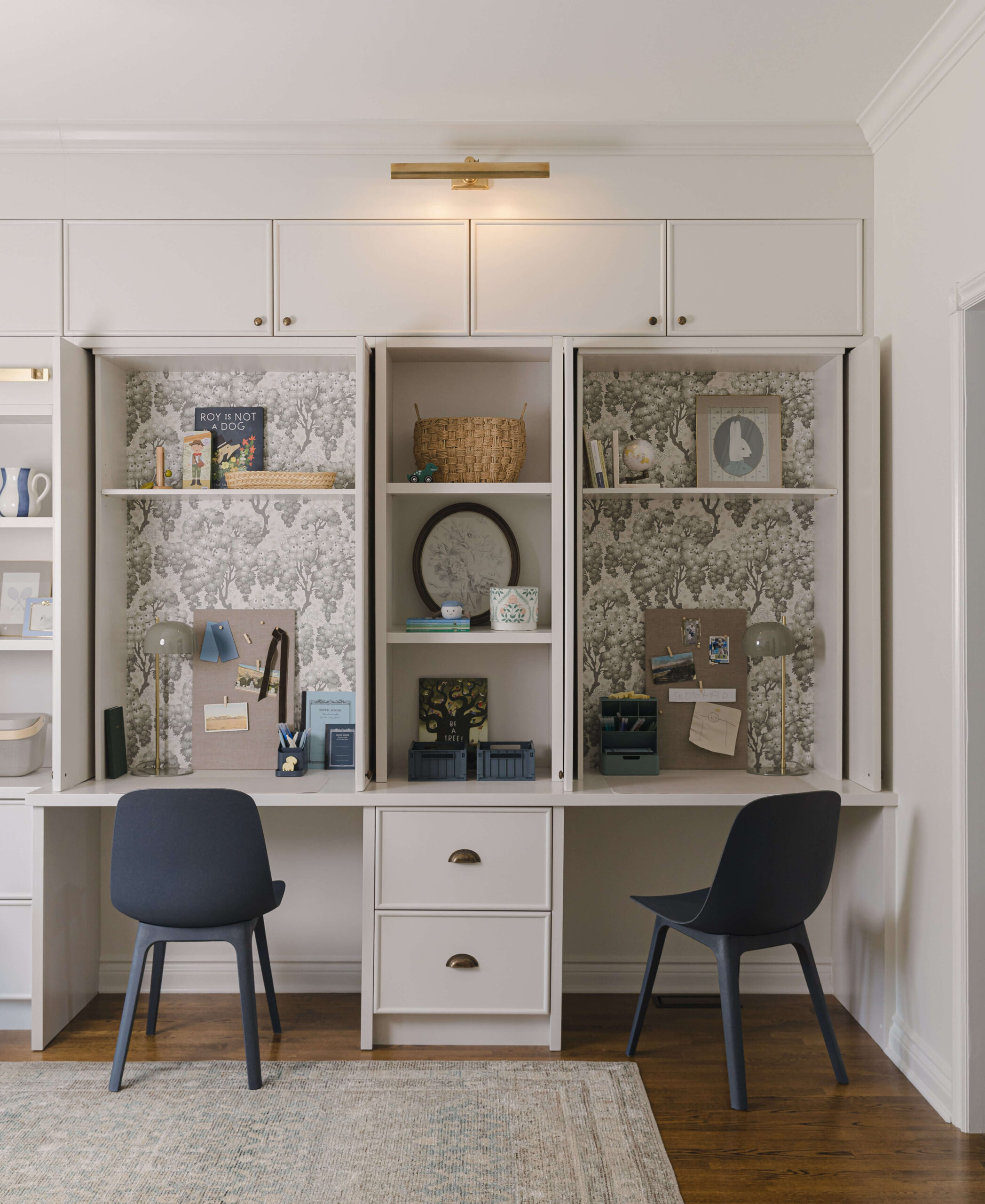
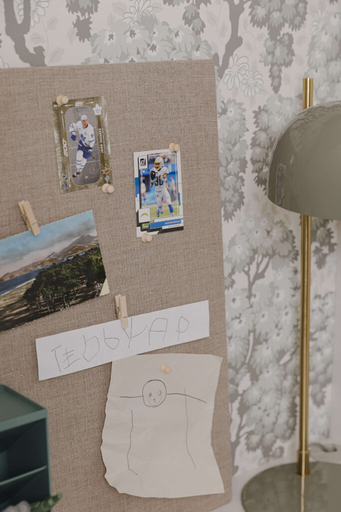
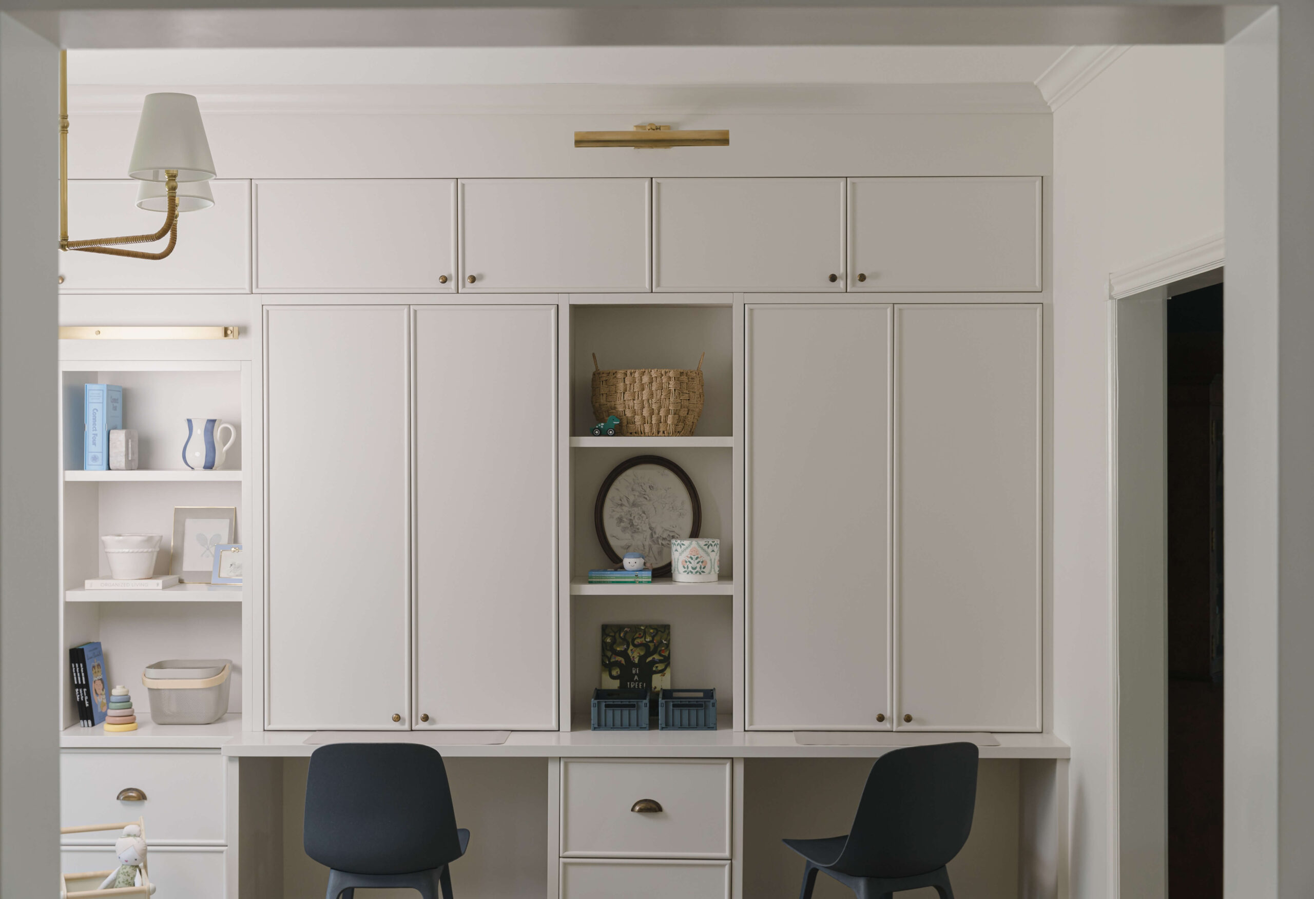
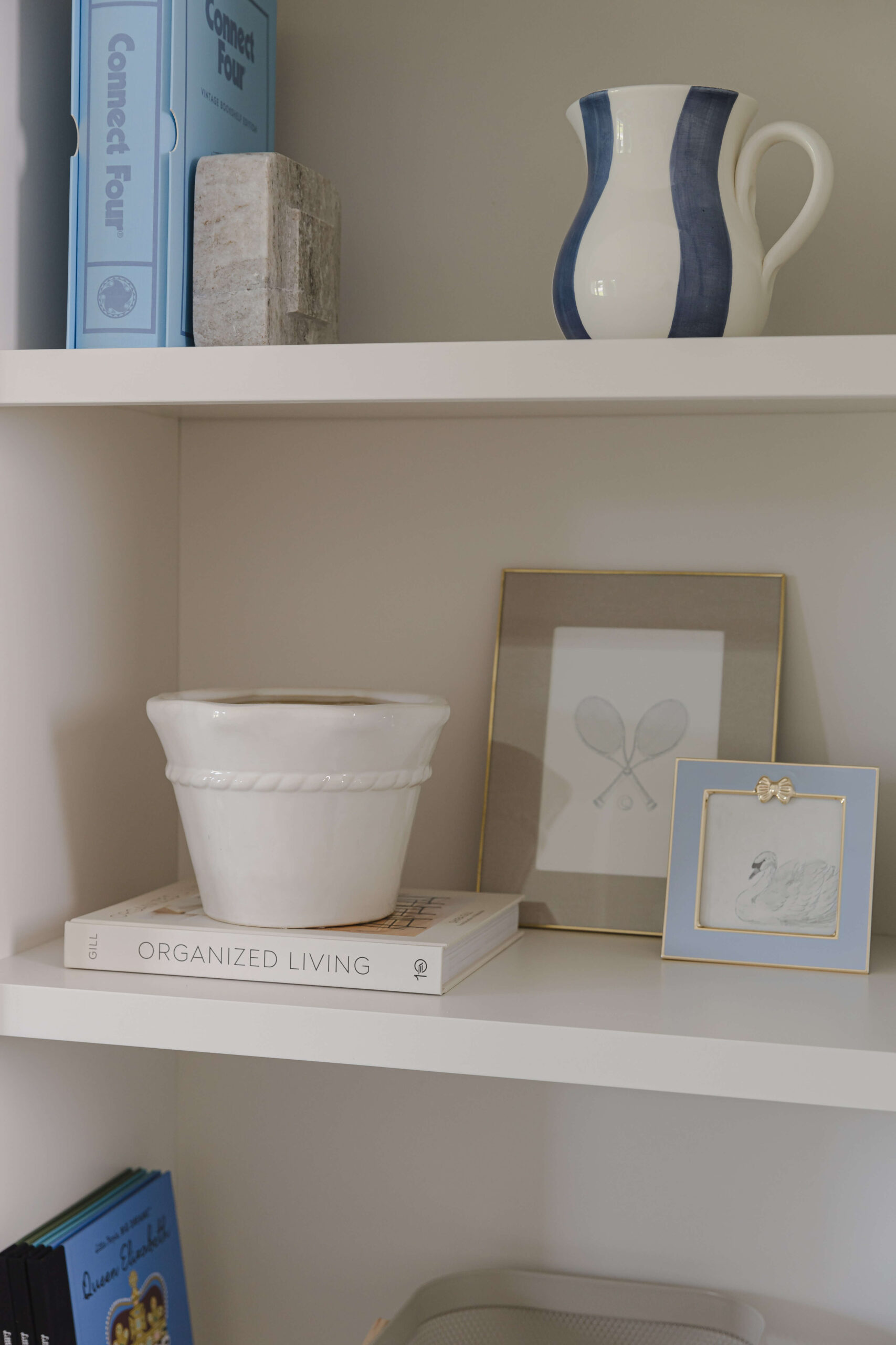
I also adore all of the texture we brought in to the space; from oak wood to linen, corduroy to wool, the room feels timeless and elegant while providing lots of interesting details for the eye to explore. I wanted to include wallpaper somewhere in the room for that added touch of whimsy, so decided to wallpaper the back of the desk nooks and not only does it look absolutely adorable, it also breaks up the full wall of millwork and delineates the two sides beautifully. It’s a small touch that adds so much character to this charming room!”
From Sonia:
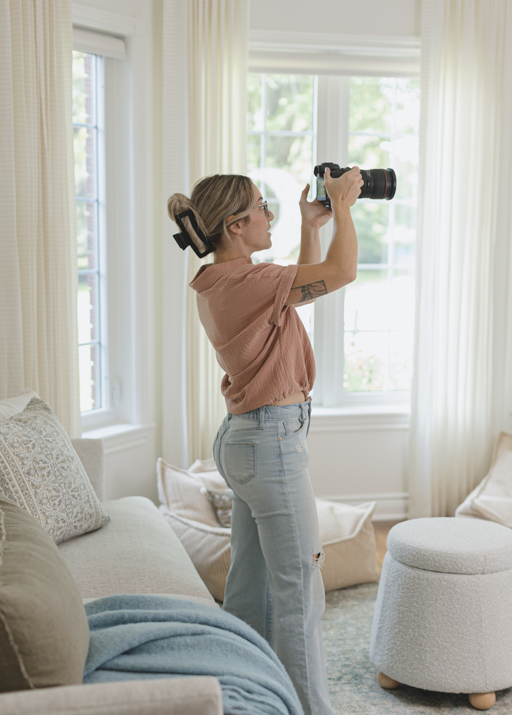
Photography is key for interior designers and adjacent businesses to show off their unique style. High quality images capture the essence of your work and help you stand out from the crowd. They bring your projects to life and let potential clients see all the fine details and creativity you put into your designs. Whether you’re updating your portfolio with your newest projects or trying to attract new clients, having the right photos can make a big difference. Feel free to reach out if you have any questions about my previous interior shoots or are ready to book your next project.