Branding Collaboration with Form & Flow Studio for Terra Skincare
Brand Identity – Your Mission
“Terra is a skincare brand that helps intentional women simplify their skincare without sacrificing quality to live a full life.”
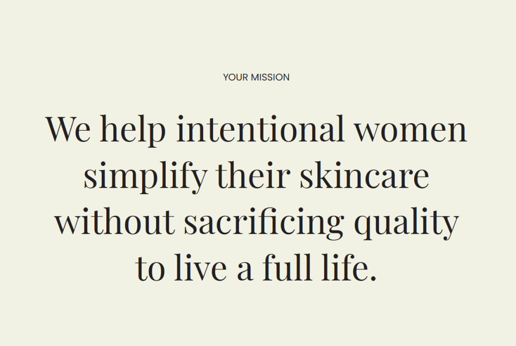
That’s a heck of a sentence. It’s one piece of Terra’s brand identity that we uncovered during our One Week Fully Aligned Branding Intensive with them. Inside this sentence lies the most core foundation of Terra’s brand identity. Now that they’re able to communicate this identity through their brand visuals, they’ll be able to seamlessly call to their ideal customers.
Brand Identity – Core Values
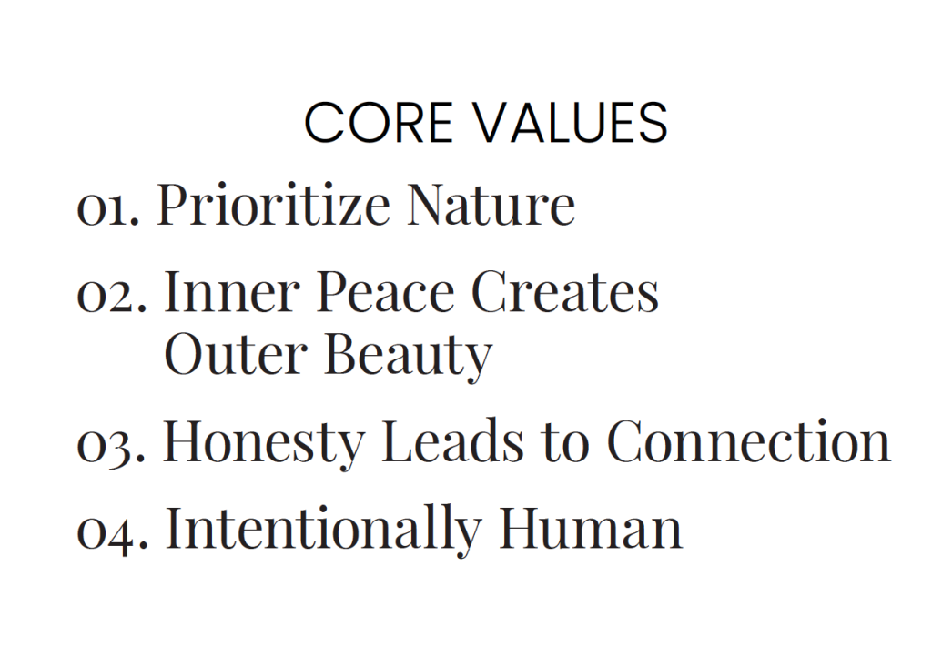
Another piece of Terra’s brand identity is their values they hold as a business. So in their case, we determined through our brand strategy session that their core values are:
- Prioritizing Nature
- Inner Peace Creates Outer Beauty
- Honesty Leads to Connection
- Being Intentionally Human
Your brand strategy is the backbone of your entire business. This information not only guides our time together in the Fully Aligned Branding Intensive, but all future decisions made by your business. Such as how to choose marketing strategies, how to go about growing your team, creating a company culture, what events you say yes to, etc. The strategy document we create with our clients is a living and breathing document that should be continually updated and added to as their business grows.
Brand Identity – Brand Voice
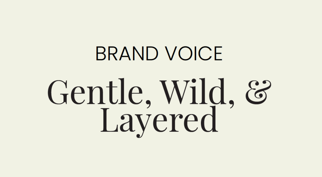
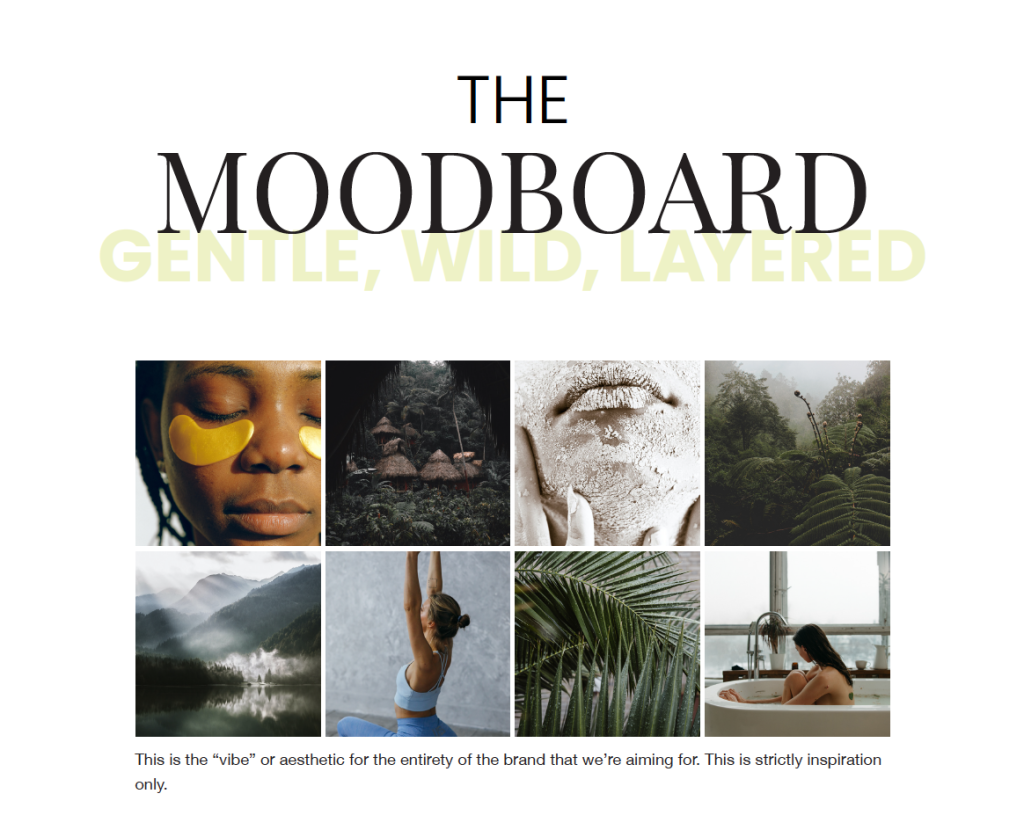
All of the work that we feed into the brand strategy churns out three key words that we then use to describe the brand’s voice. These words are key visual pieces that help us translate their strategy into a form usable as inspiration for their branding visuals (logo, colours, fonts, templates, packaging, photography, videography, social media, etc). Terra’s three key words?
Creative Execution
Now that we’ve worked through Terra’s brand identity, we can use that to come up with a plan for creative execution. What does intentional living, prioritizing nature, honesty, connection, inner peace, and outer beauty actually look like? We had so much fun bringing this concept to life. Bringing our expertise and combining it with their style preferences, access to tools and props, and their ability to recreate and use their branding and photography, we were able to craft a unique and strategic visual identity for them.
Creative Execution – Brand Design
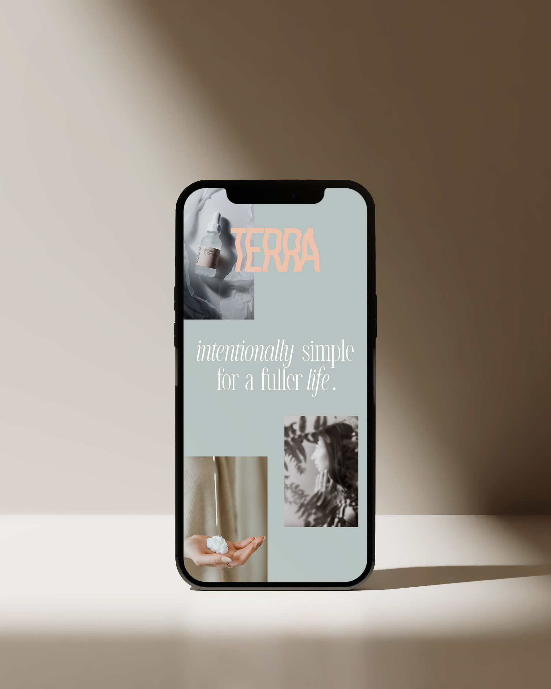
For the visual direction, we wanted to make sure we had something that was earthy and calming, but still captured interest and didn’t blend into the market. Overall we’ve seen a trend towards more natural products, especially in skincare. So our goal was not just to create a natural and calming skincare brand, but one that was different from the market.
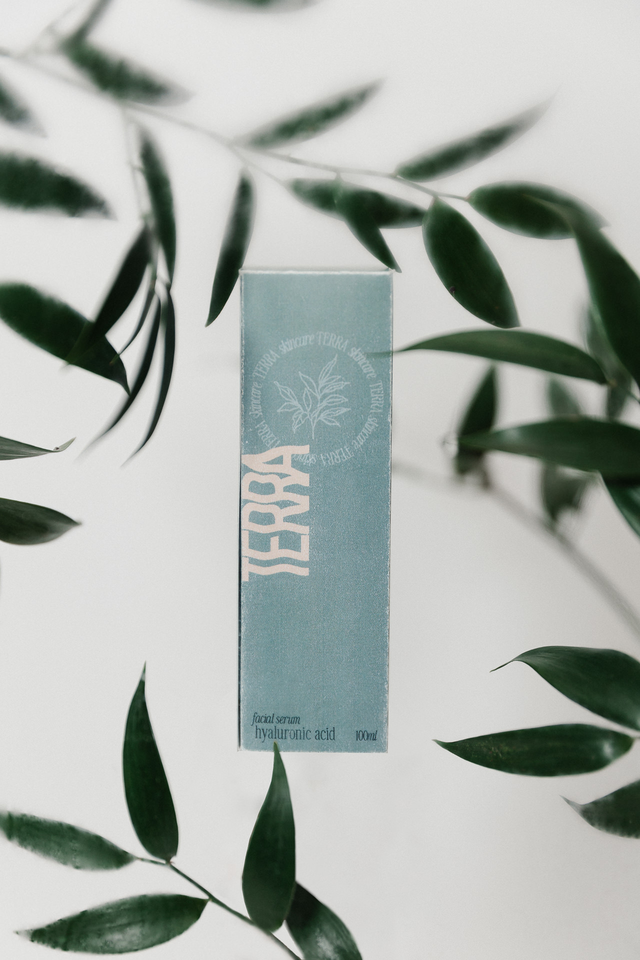
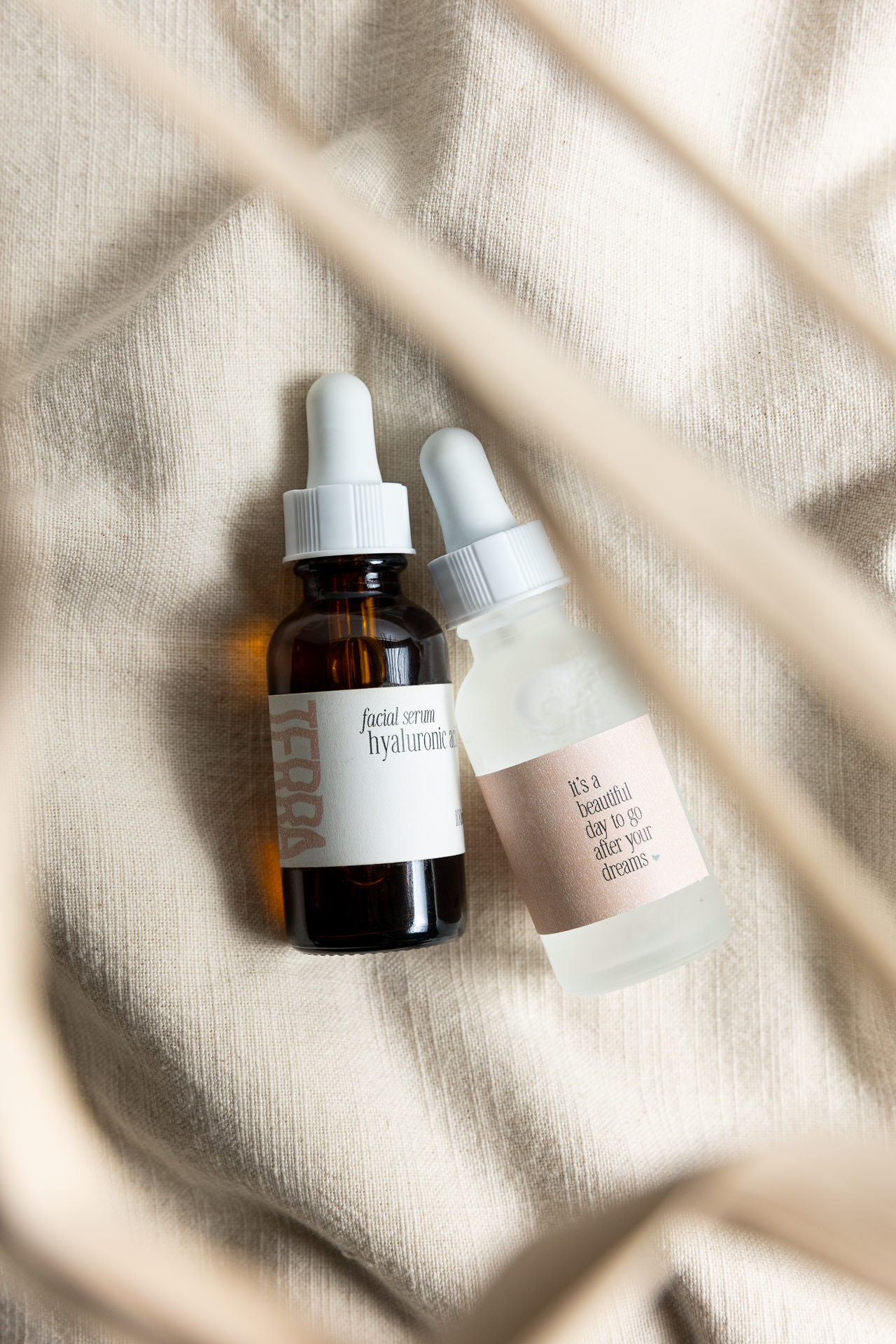
To do this, we used natural colours, but mixed in a couple accent colours. Also leaning more into the blues than the traditional greens. The fonts we chose for the brand are also part of what makes it so unique. We chose a bold type for the logo to stand out and add a modern touch to the serenity that is in other aspects of the brand. We also chose a sans-serif, a round body copy and a monospace font. The sans-serif adds in that element of elegance, the round body is welcoming and easy to read, with the monospace adding in some of that technical and scientific element.
Each element is layered together to give depth and create a modern, gentle, elegant brand. This combined with the photography balances all the key words and create a complete visual identity that is unique and balanced.
Creative Execution – Brand Photoshoot
Because we had a packaging add-on for Terra’s package, Sonia designed two different photoshoots: the first is their custom Creative Photoshoot and the second was their Product Photoshoot.
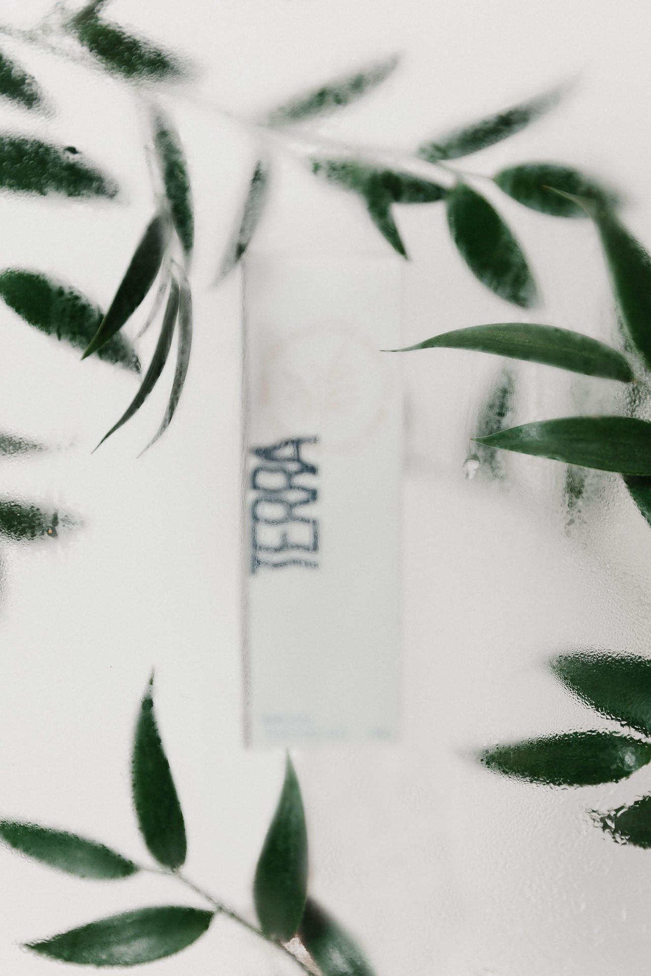
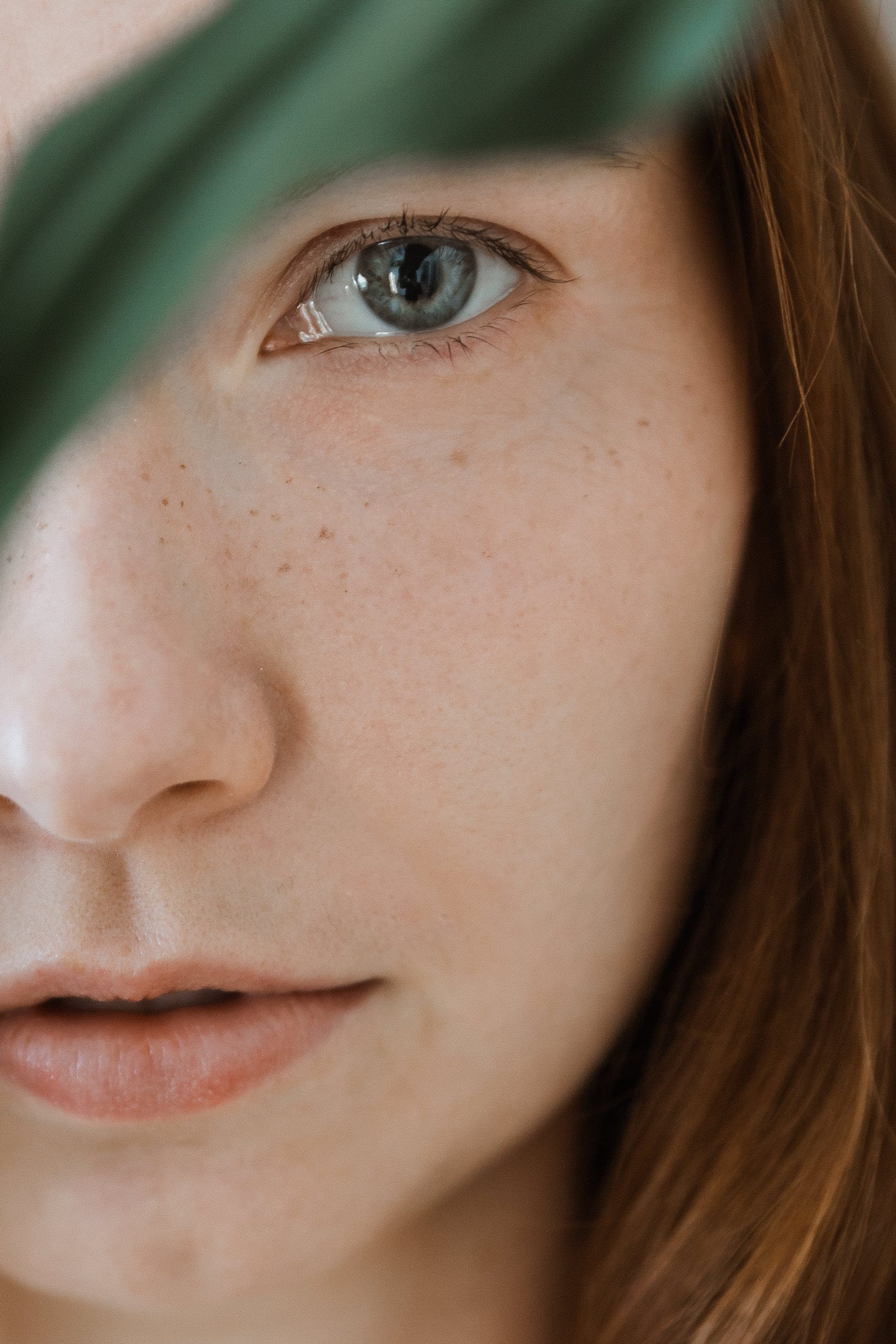
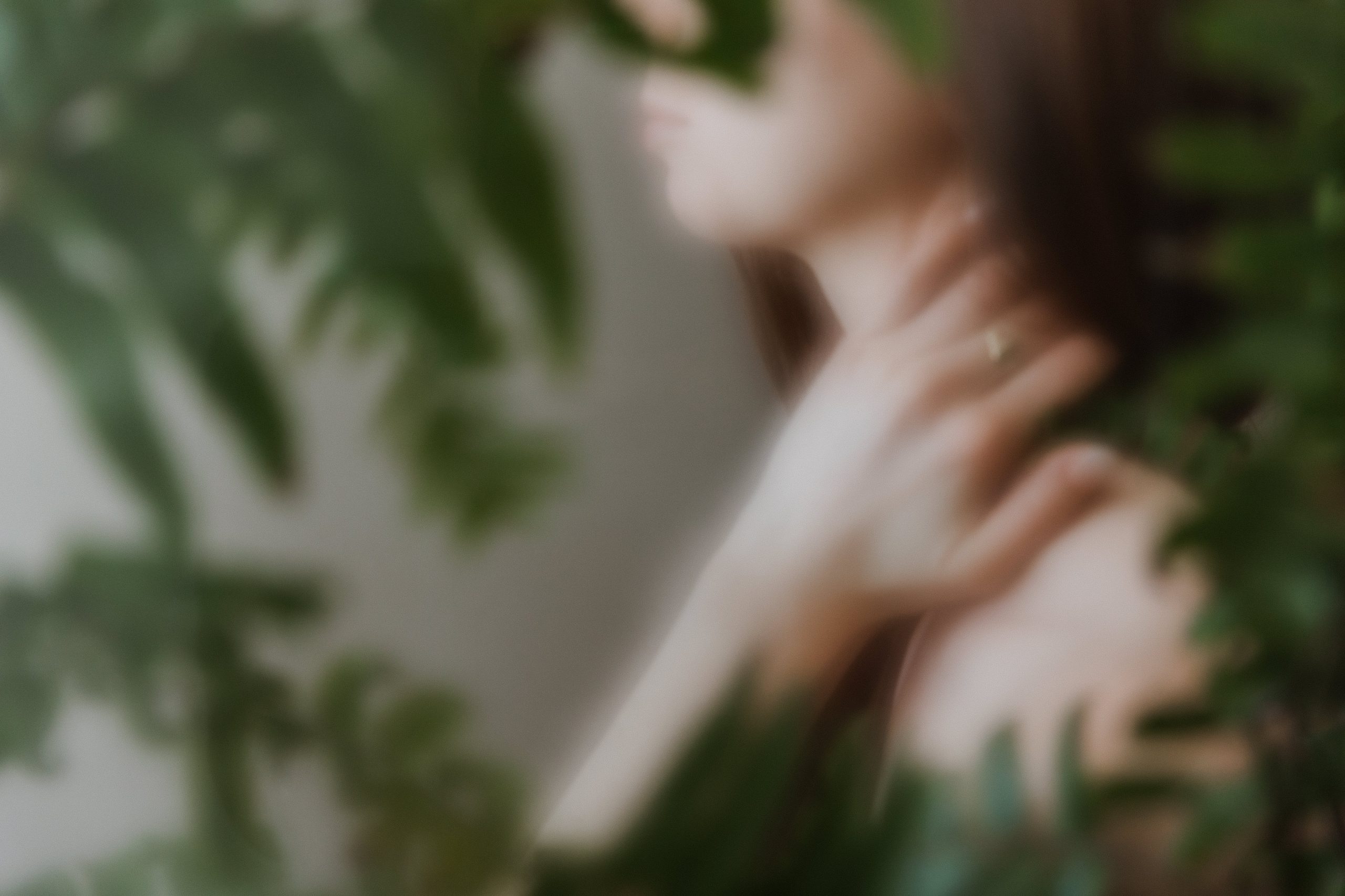
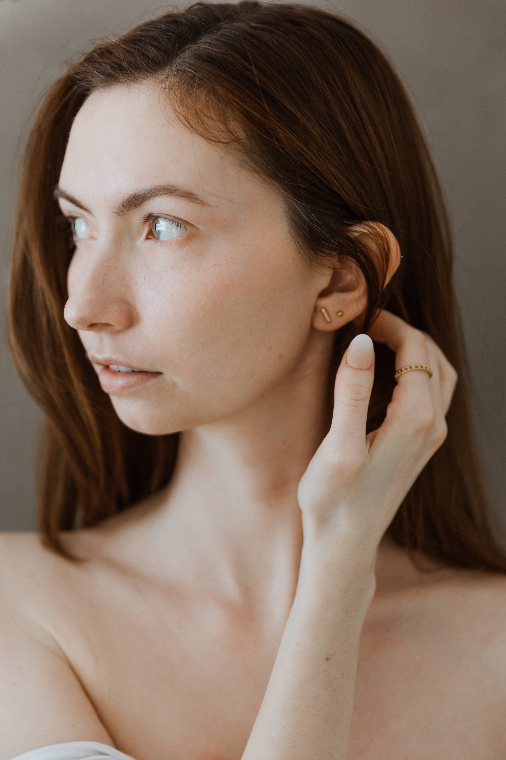
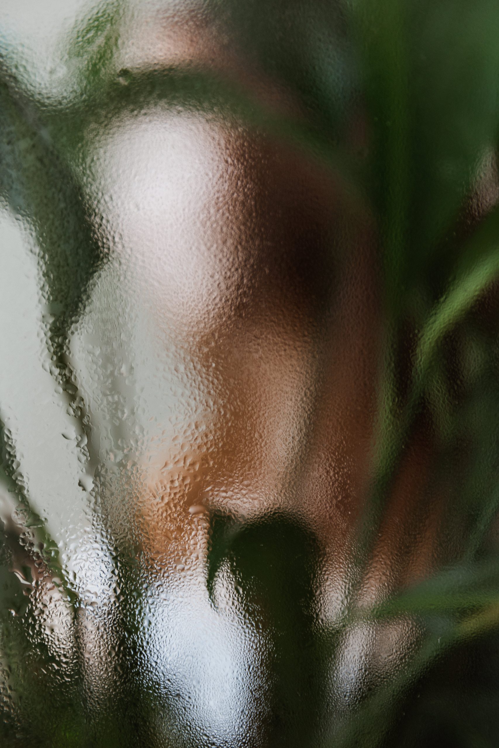
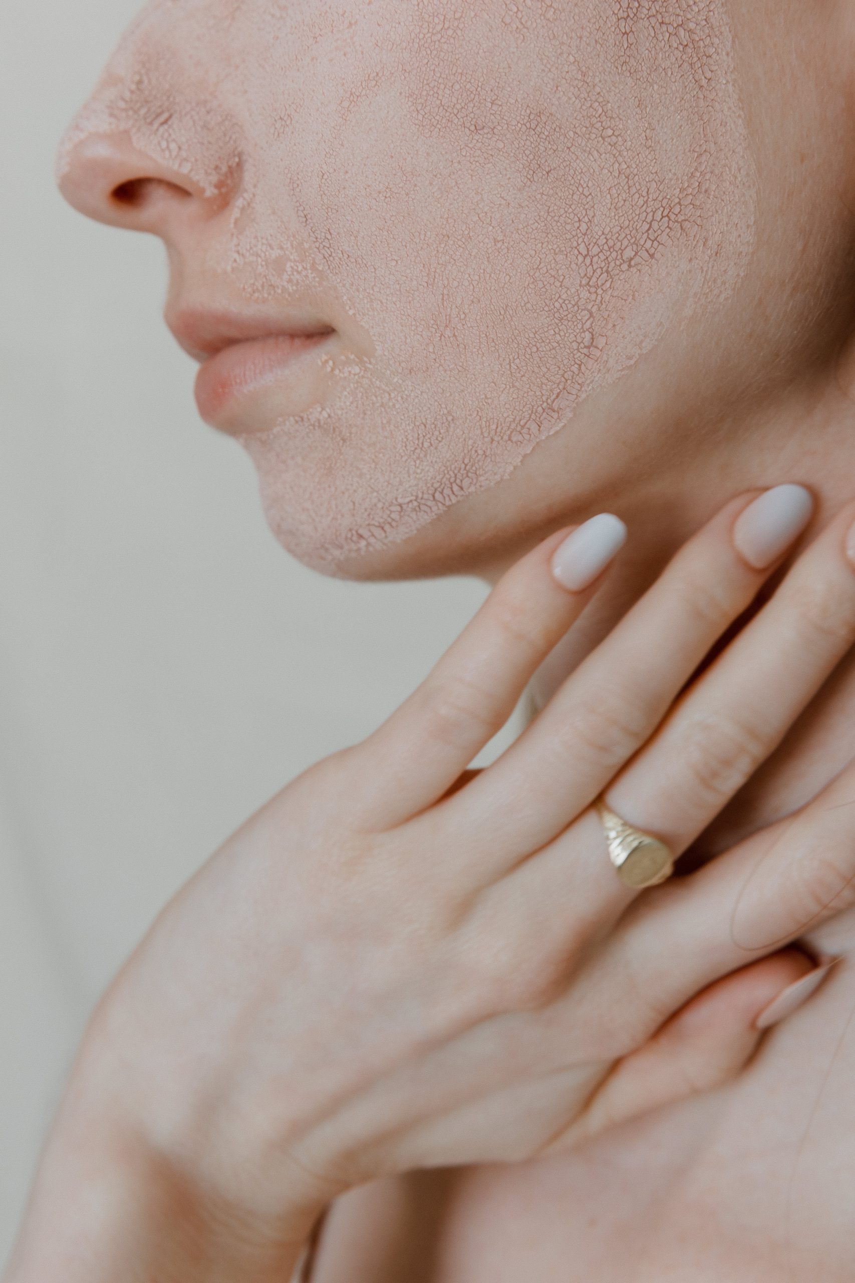
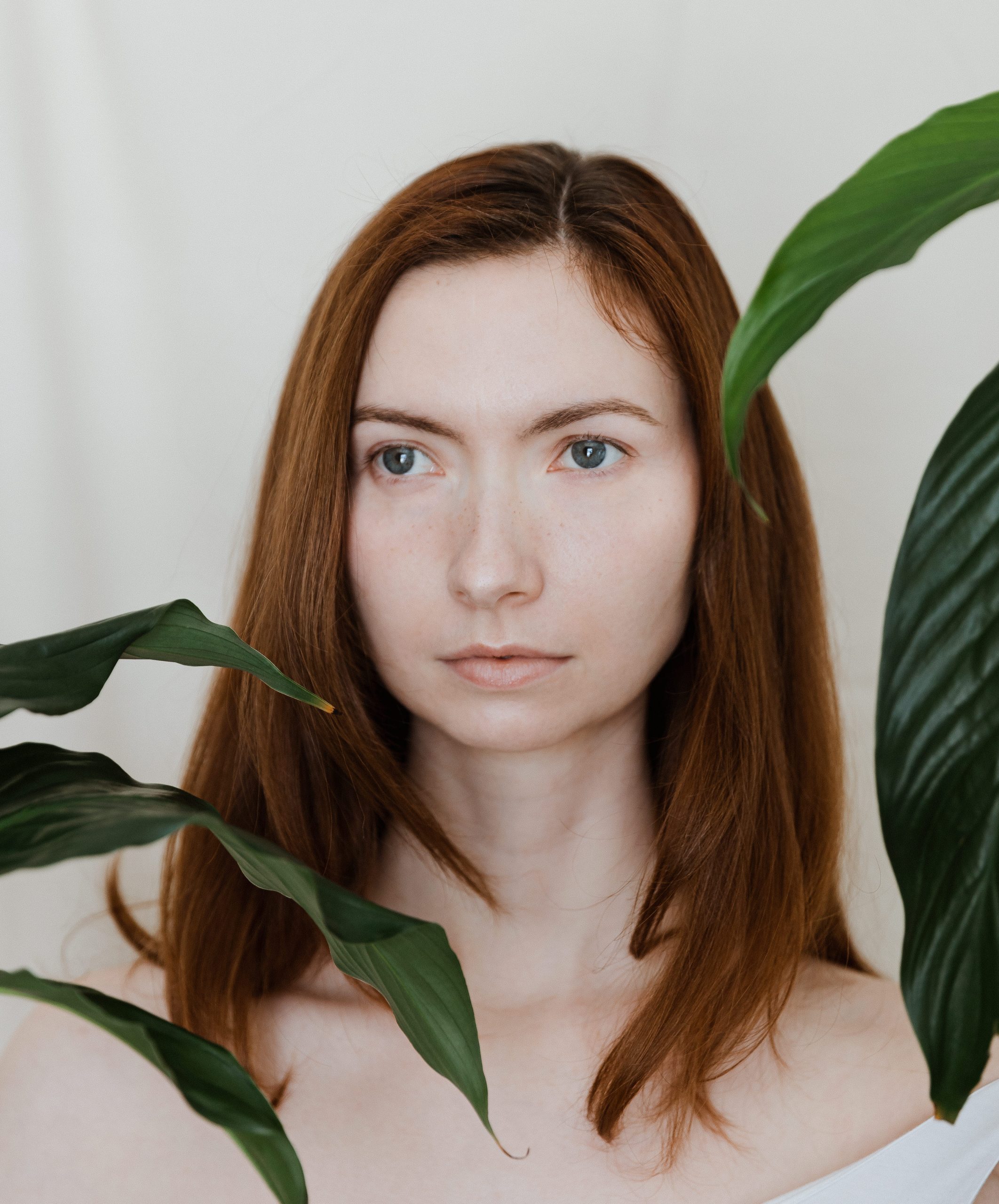
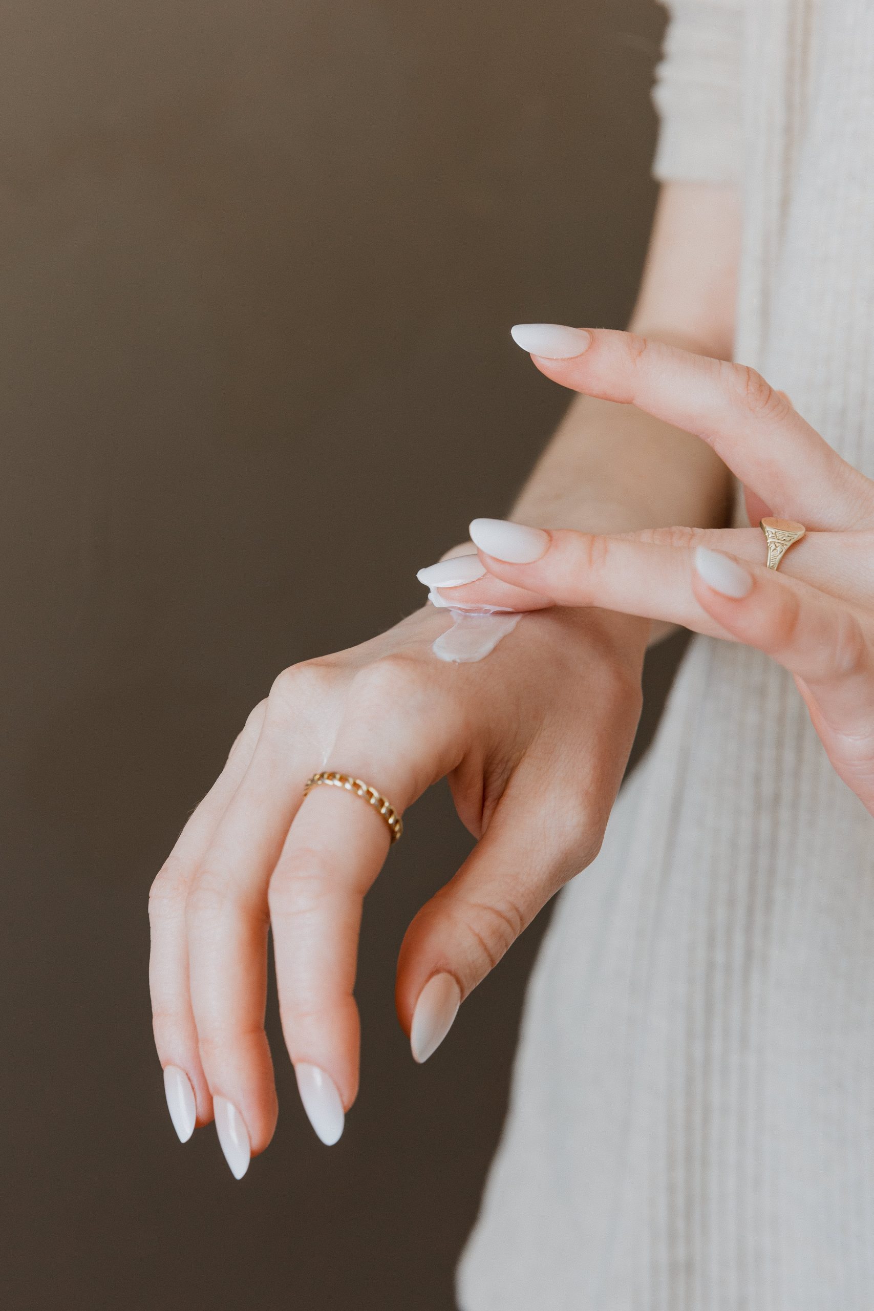
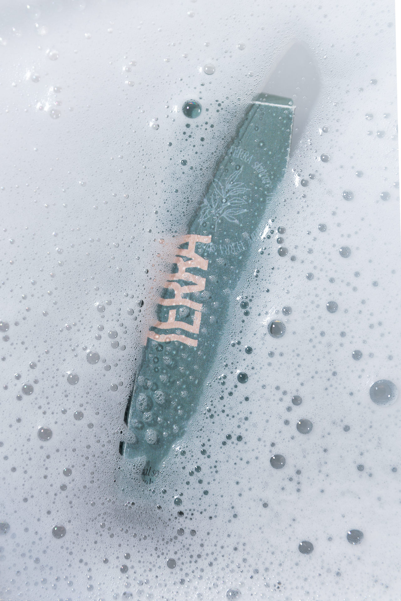
For their Creative Shoot, we brought in a model between 25-45 years old with clear skin. We photographed her with very minimal makeup on to show her natural beauty and brought in tropical plants and a sheet of glass with steam and condensation to add layers. And of course, we brought in skincare products to interact with. In the interest of keeping a gentle feeling across the gallery of images while also creating a look of being in the wild, all colour tones used were kept neutral. If you remember, our brand identity keywords are gentle, wild, and layered. And the concept for this shoot was to capture the contrast of these words within the context of skincare.


Creative Execution – Packaging
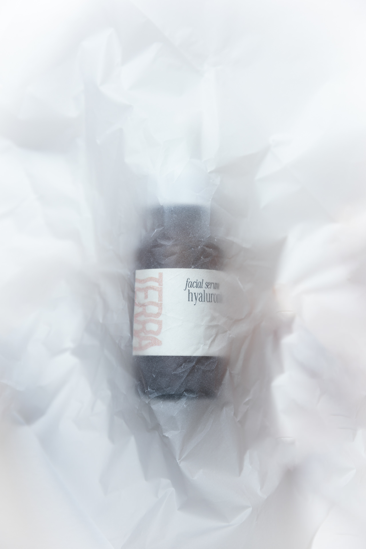
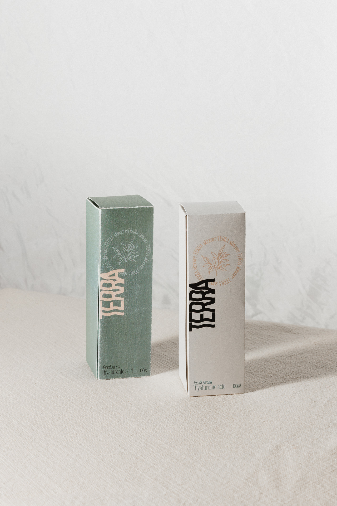
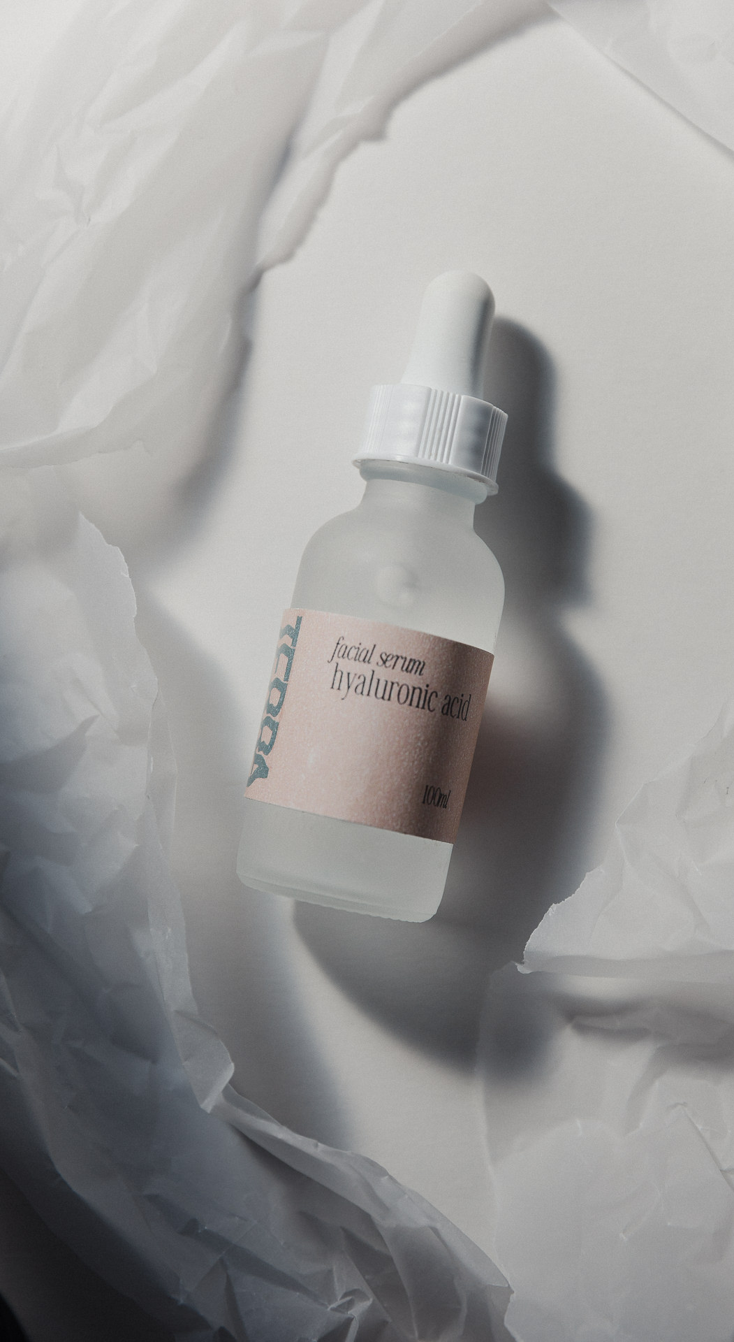
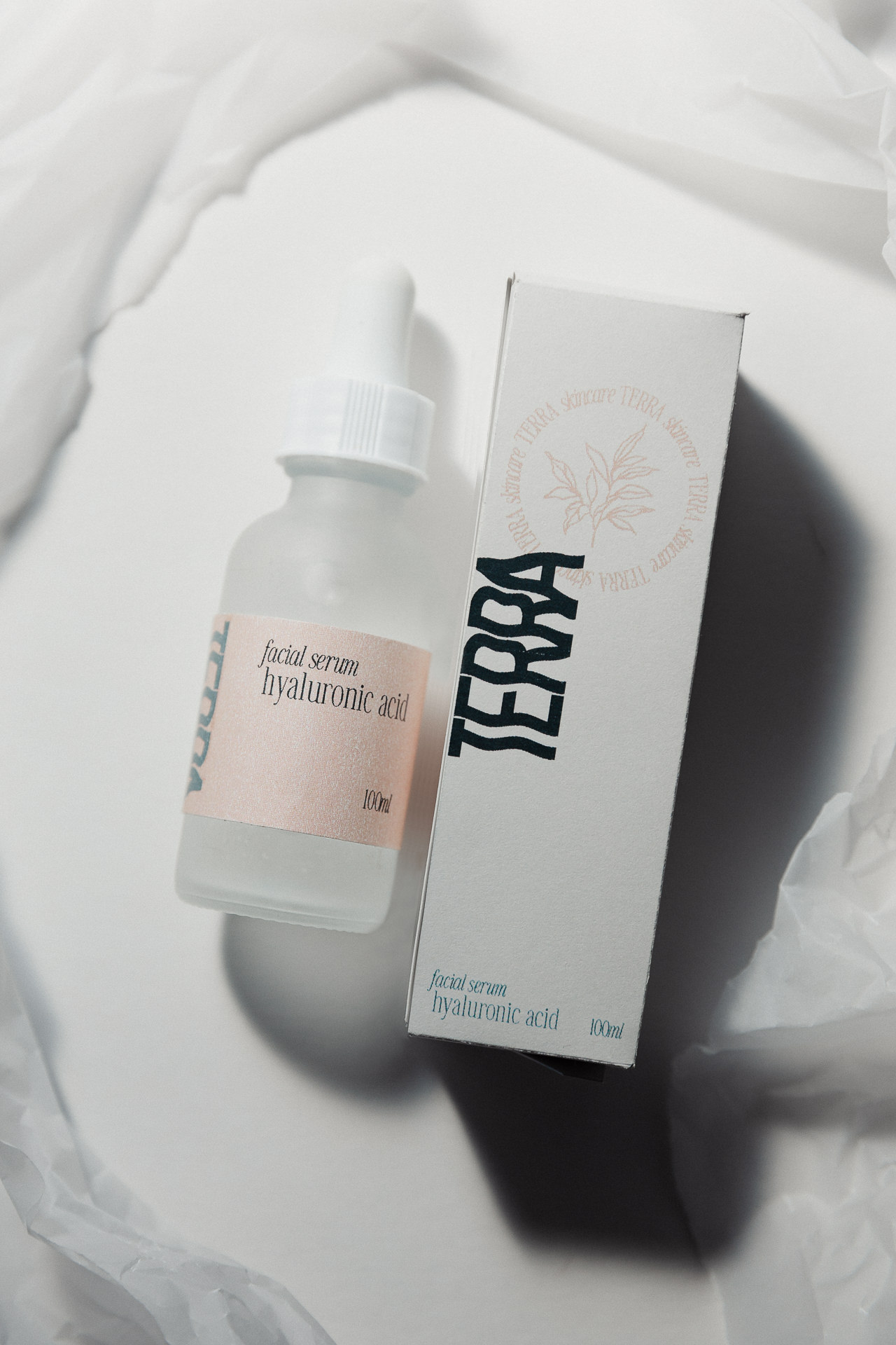
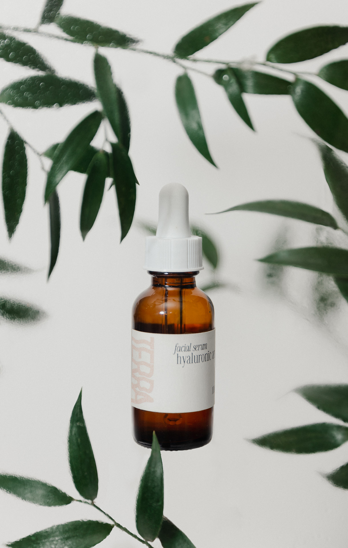
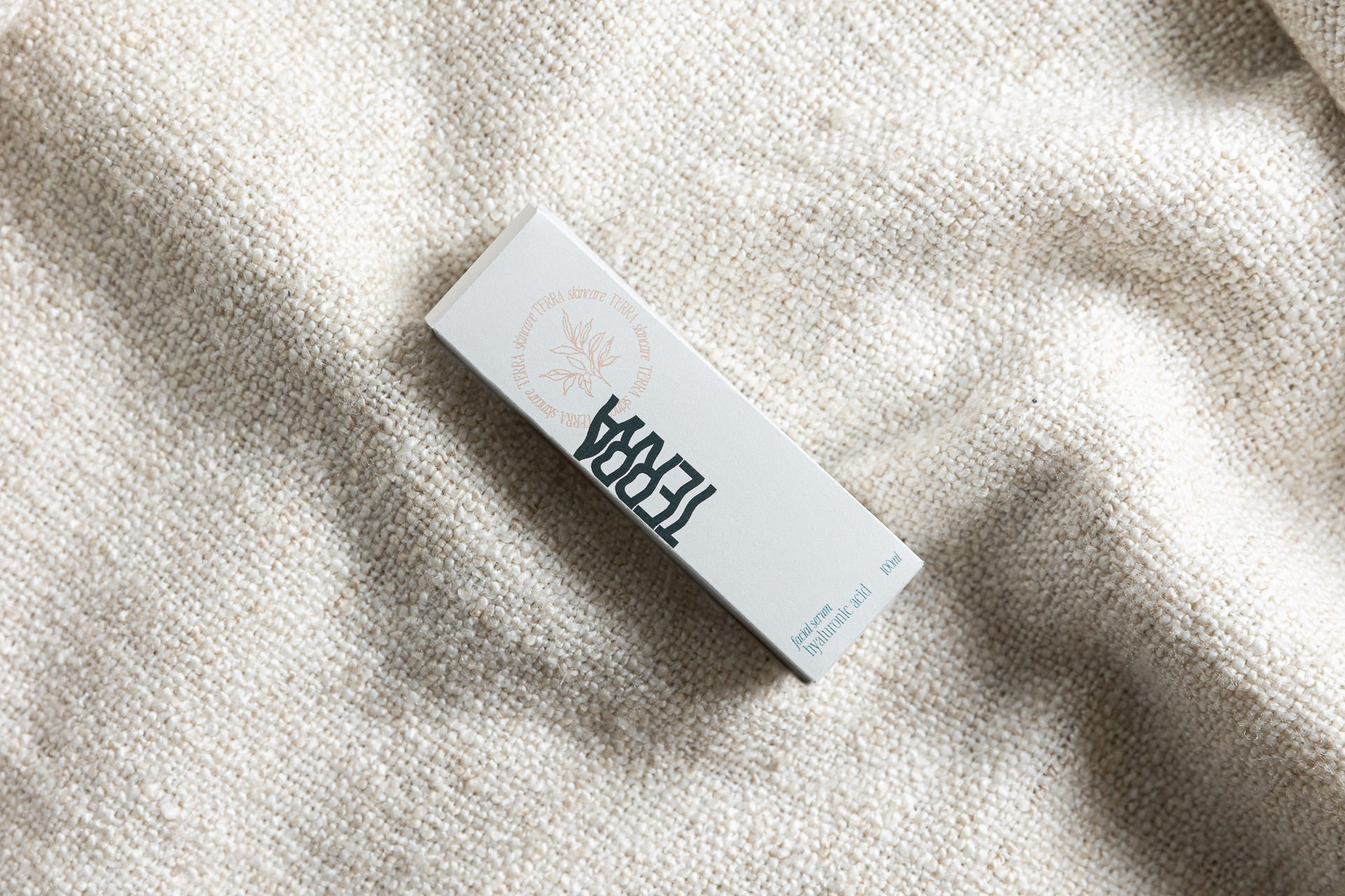
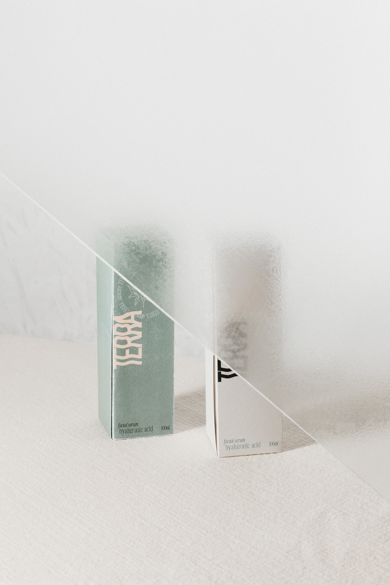
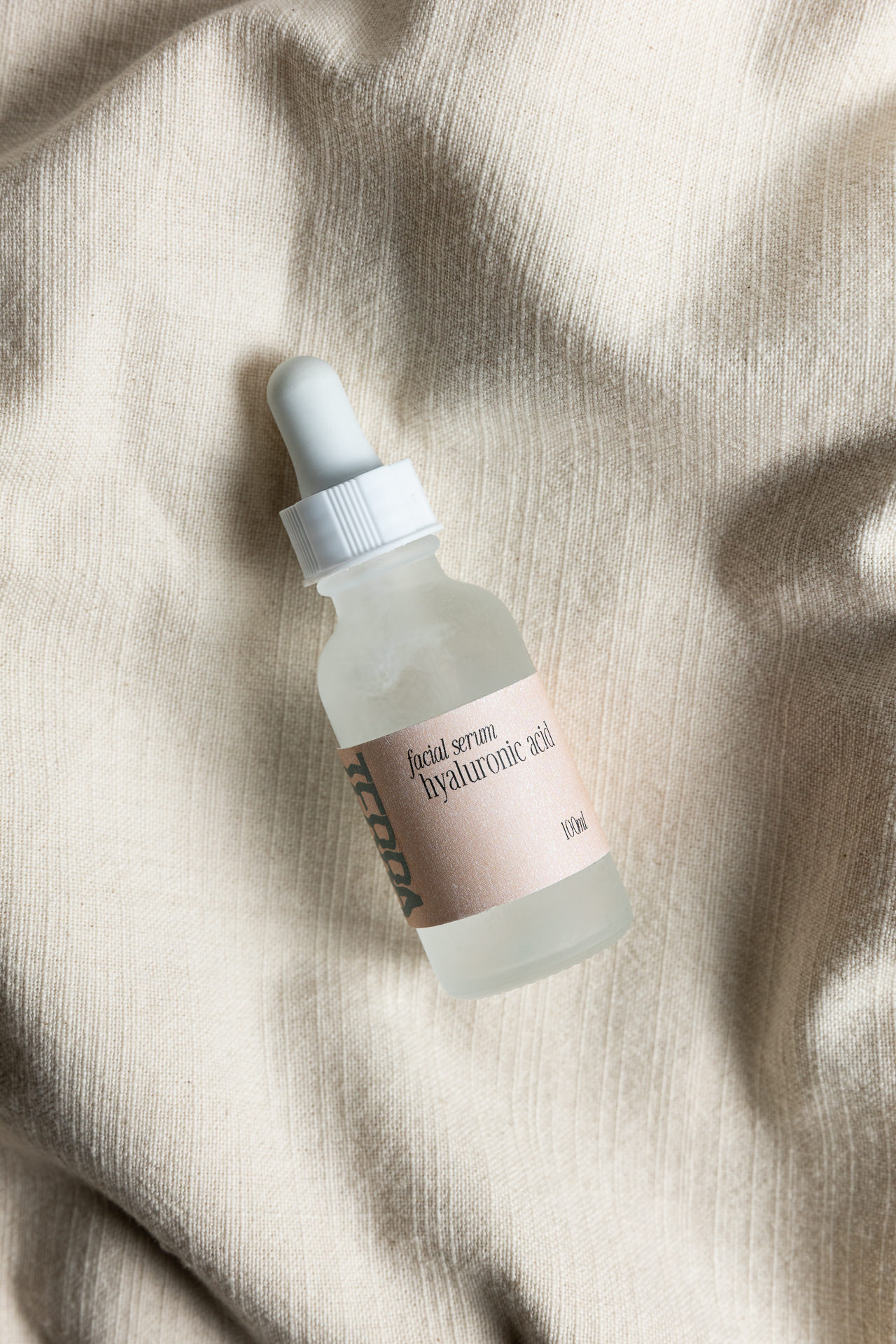
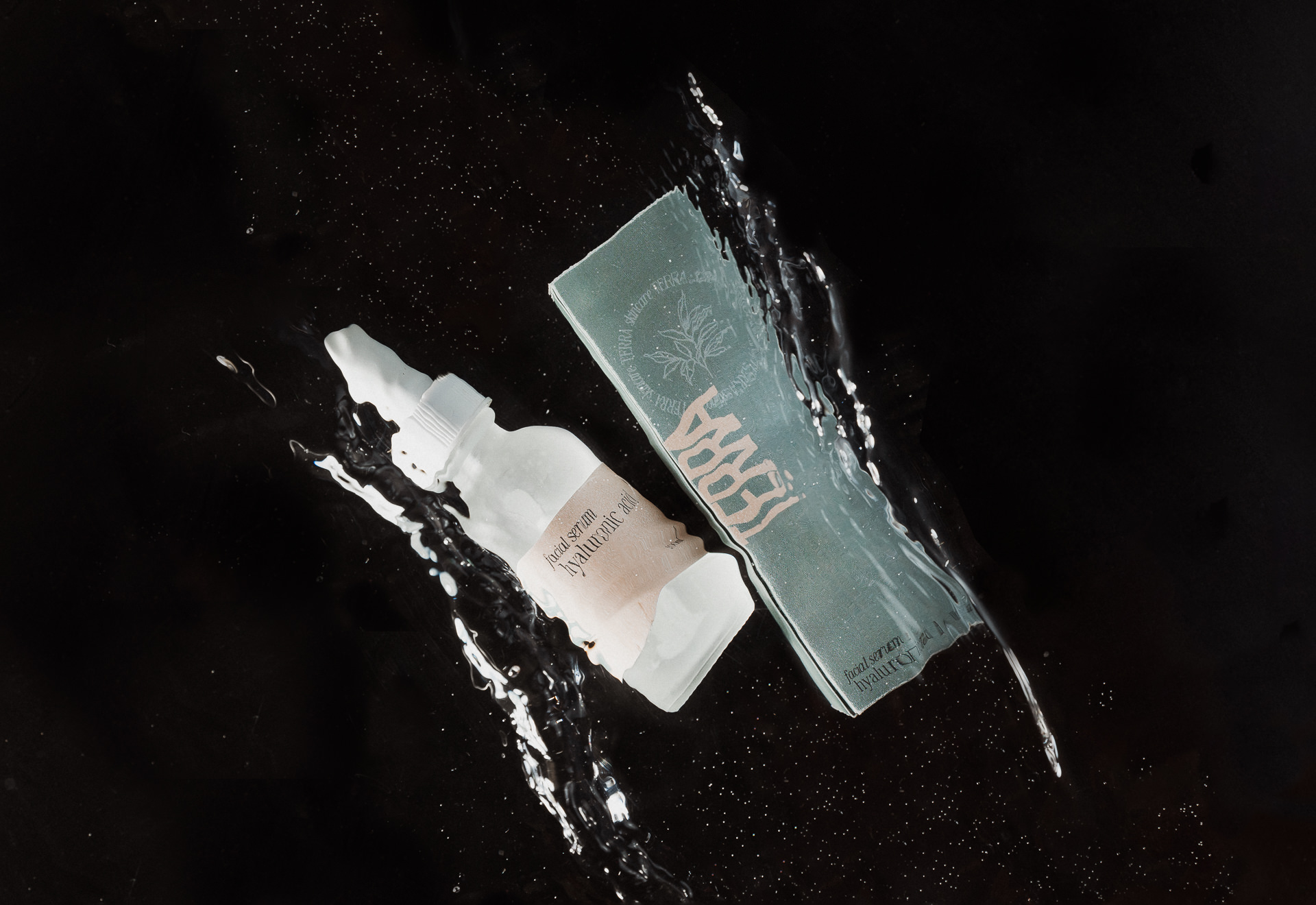
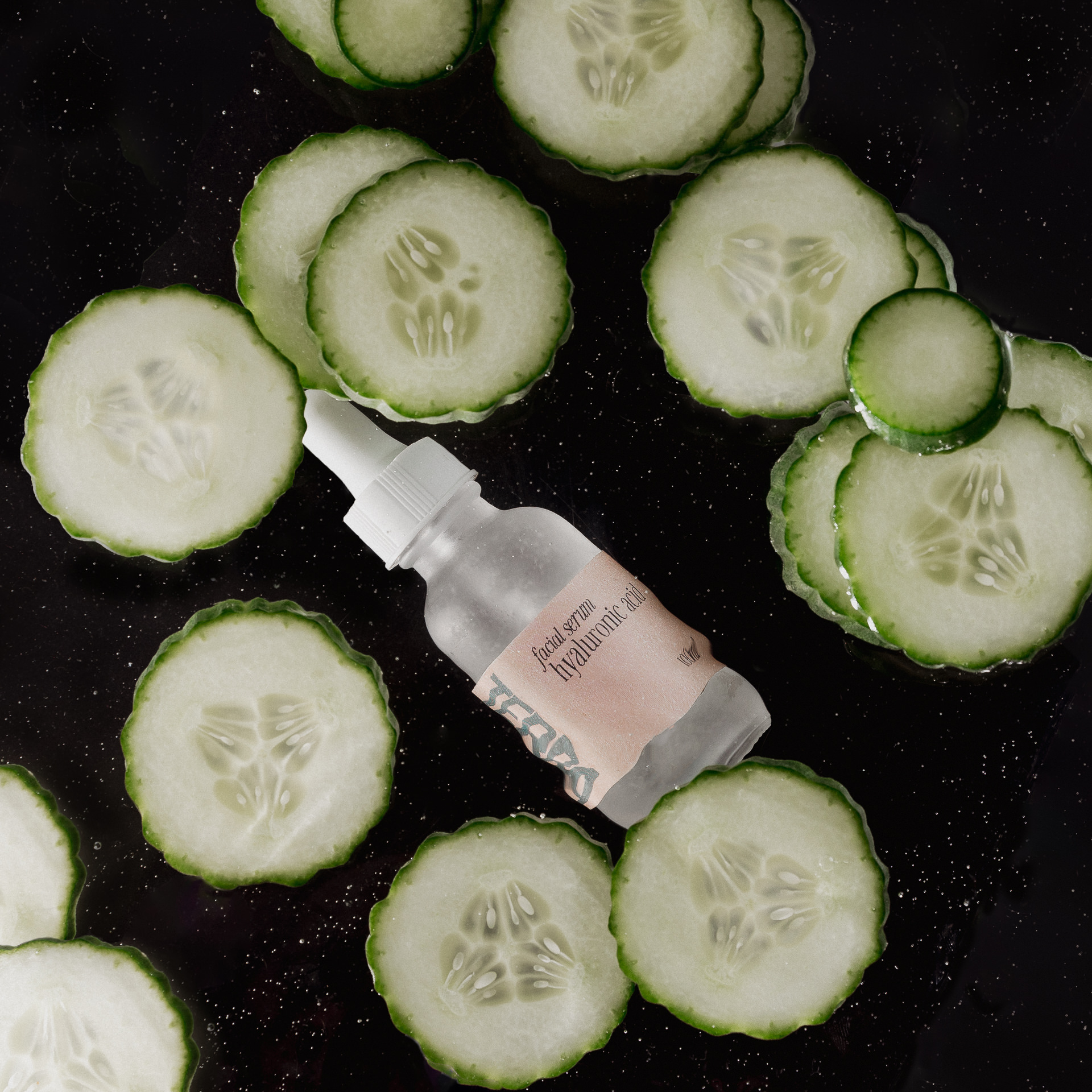
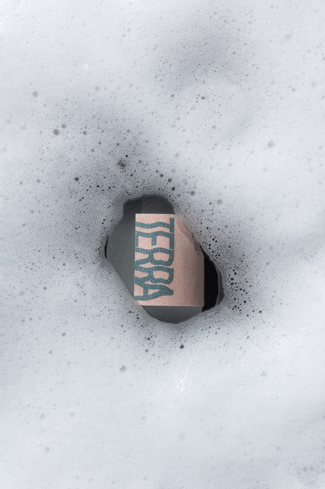
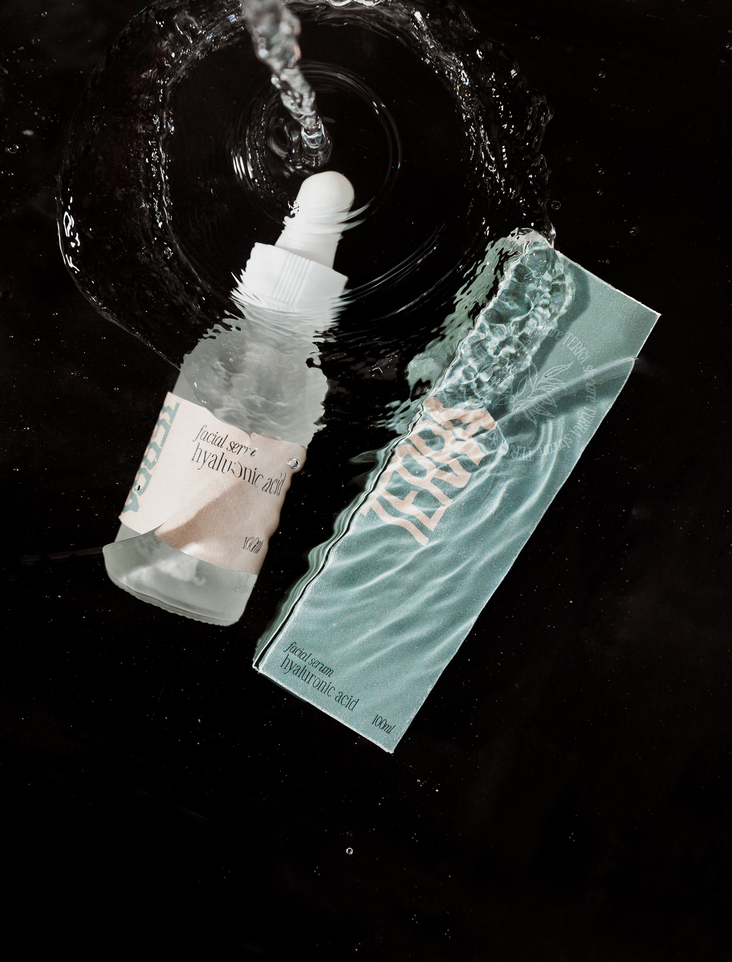
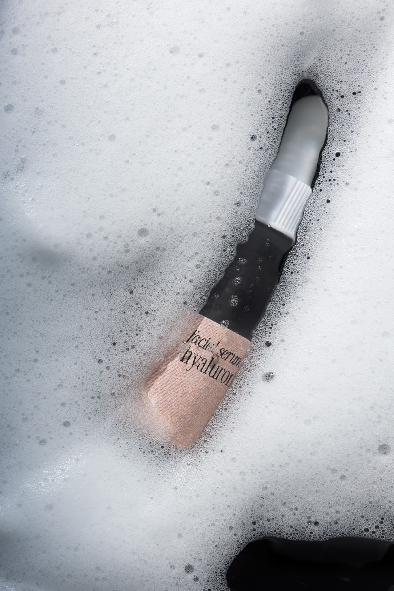
Like I mentioned before, packaging design and photography was added to the Fully Aligned package, so the following week, Tasha designed packaging for 2 facial serums and then Sonia photographed it. Further keeping in line with the core mission of the brand being to help intentional women simplify their skincare routine without sacrificing quality to live a full life, we crafted packaging an images that represented the beauty of Terra’s brand.

Is your brand in need of some Fully Aligned love?
Meet the creators:
Tasha, Strategist and Designer: Form & Flow
Sonia, Strategist and Photographer: Sonia V Branding
